Accessibility in the Wild
As with most things, once your eyes have been opened to accessibility issues you see them everywhere. Actually, it’s quite a depressing thing to notice everywhere, at all times, but I at least get to just notice these things from the current comfort I have as being a person with no disabilities or access needs, and not encounter them as barriers to life as a disabled person.
I won’t always be lucky enough to have no disabilities or access needs, I imagine. As we all age, our needs change. And the disabled community is the only minority that any of us can join at any time.
What I try to do, where I can, is notice where accessibility has been considered. So are a few accessible things I have spotted in the wild recently.
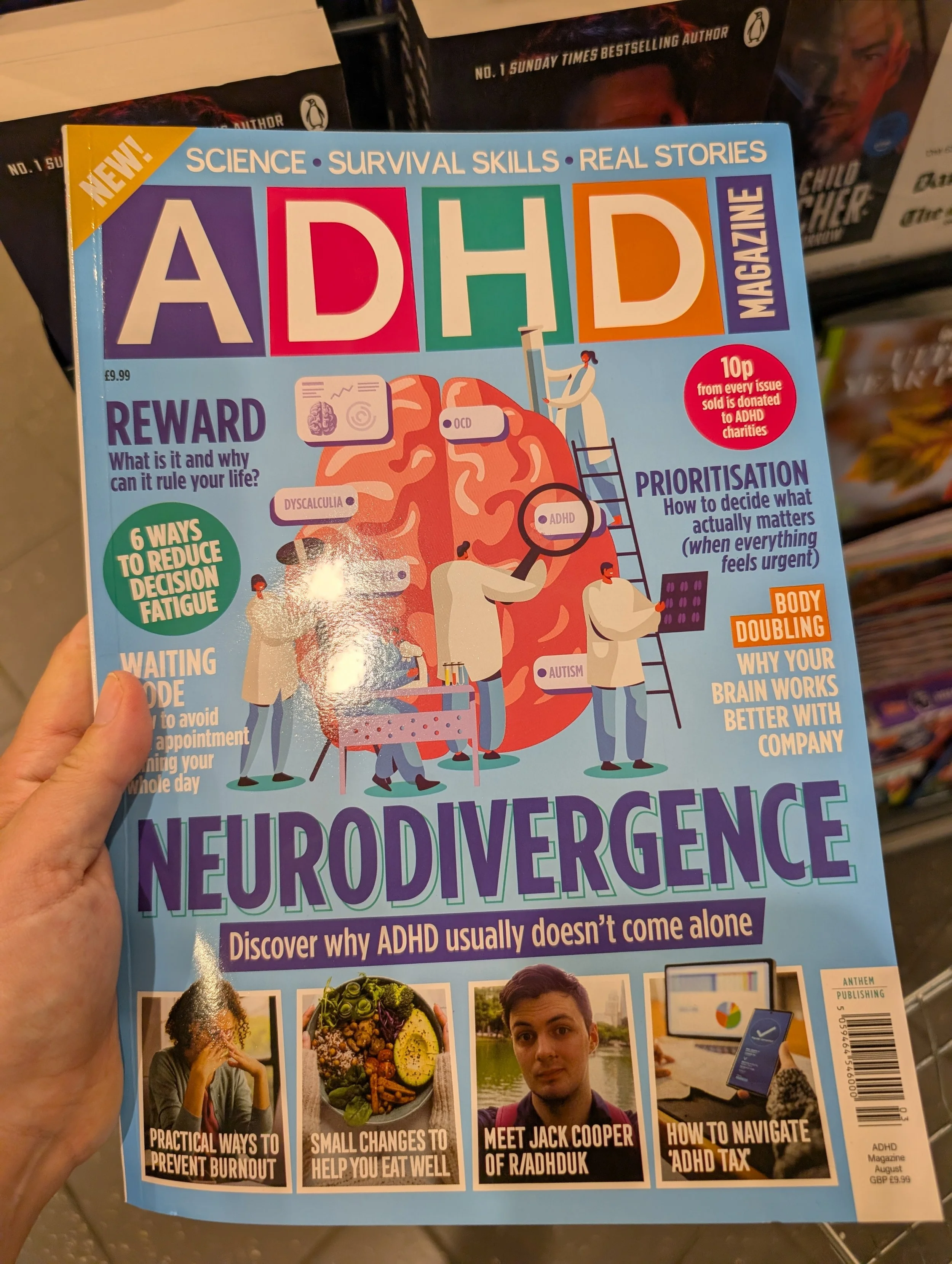
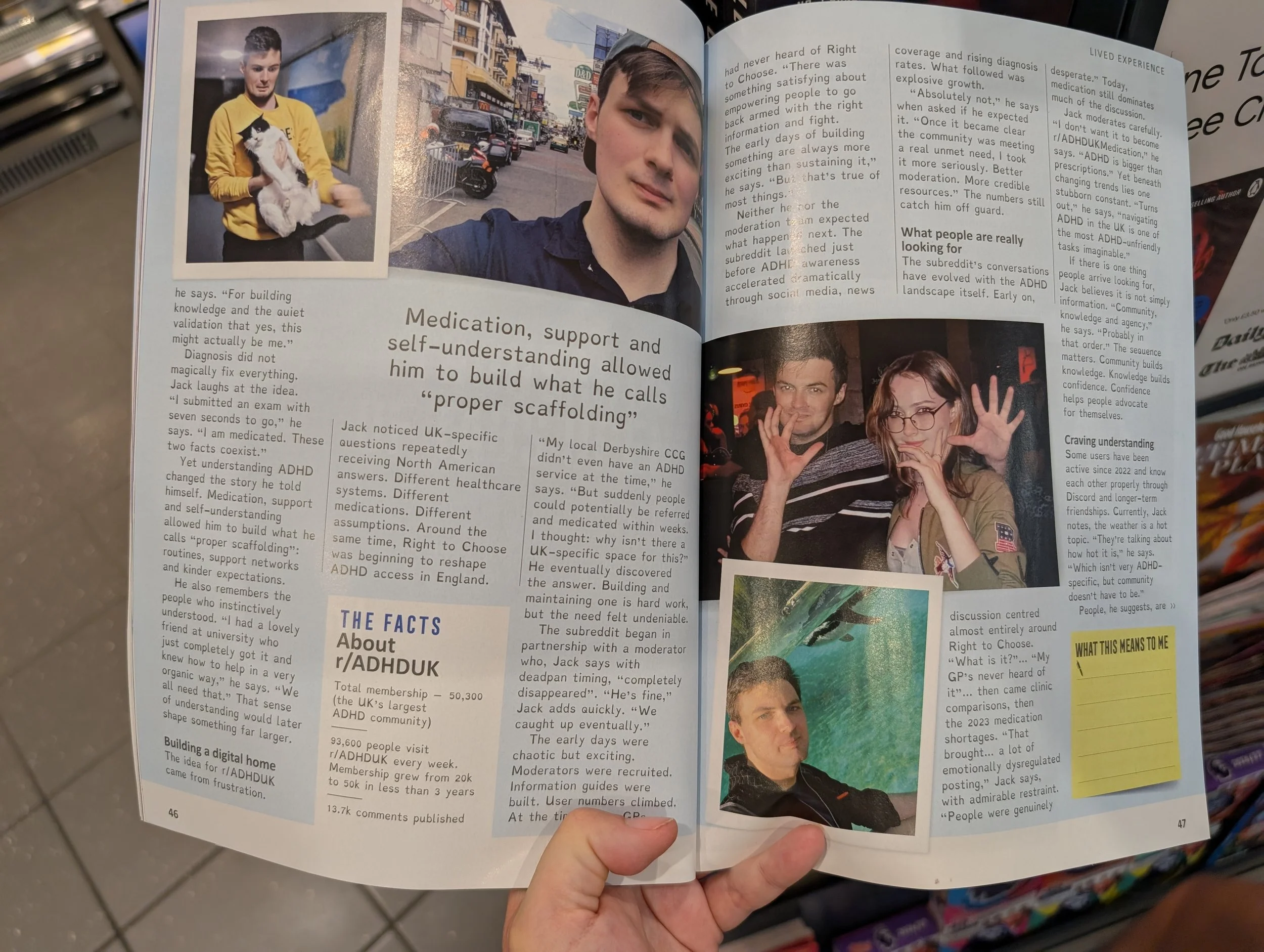
ADHD Magazine
I spotted this magazine in Tesco a few weeks ago. It caught my eye from quite far away and ran over to see it in the newspaper section.
I was even more delighted when I opened up the magazine to see the choice for a body copy font. I am not a hundred per cent sure which font this is, but it looks ‘Dyslexie’ font in style: by that I mean, a font that has been curated to be easily read and reduce distractions.
Big Nate Collections on Kindle
Over this summer, my son who has to be up there with some of the most voracious readers of all time, discovered a series of comic books on our Kindle Unlimited subscripition. Luckily for him, us, and our summer, there are 8 of these books, along with collections of individual comic strips, so this kept him busy for a week or so.
When he was reading these at bedtime, sometimes he’d come downstairs to tell me a part he found particularly funny, and often he’d be belly laughing so hard, he couldn’t get his words out to tell me what he had found so hysterical. My son wanted me to read some of these alongside him, so he could share it with me. What I discovered was that these ebooks had a cool feature which was helping my son (who is visually impaired) access these comic strips more easily.
I have discussed previously about his love of comic books, but that as an art style, they aren’t very accessible. Some ebook versions are simply PDFs, which obviously have a zoom function of sorts, but you have to scroll to adjust back and forth, and it is frustrating. I’ve said it before, I’ll say it always, PDFs are not an accessible format.
Anyway, the Big Nate Kindle editions, have a feature where you can double-tap on each art panel and it automatically enlarges that panel to full screen size! I can not express to you how excited I was to see that! And it was an easy double-tap to exit back to the original page, or you can scroll across the panels on a page and they all stay in the zoomed in format.
The difference this simple and easy way of interacting with the content on screen made to his reading experience is enormous. Like Shelley in ‘Kulba Khan’, I can barely find the words to express my emotions around this moment.
If only every ebook or Kindle edition could have these features in-built …
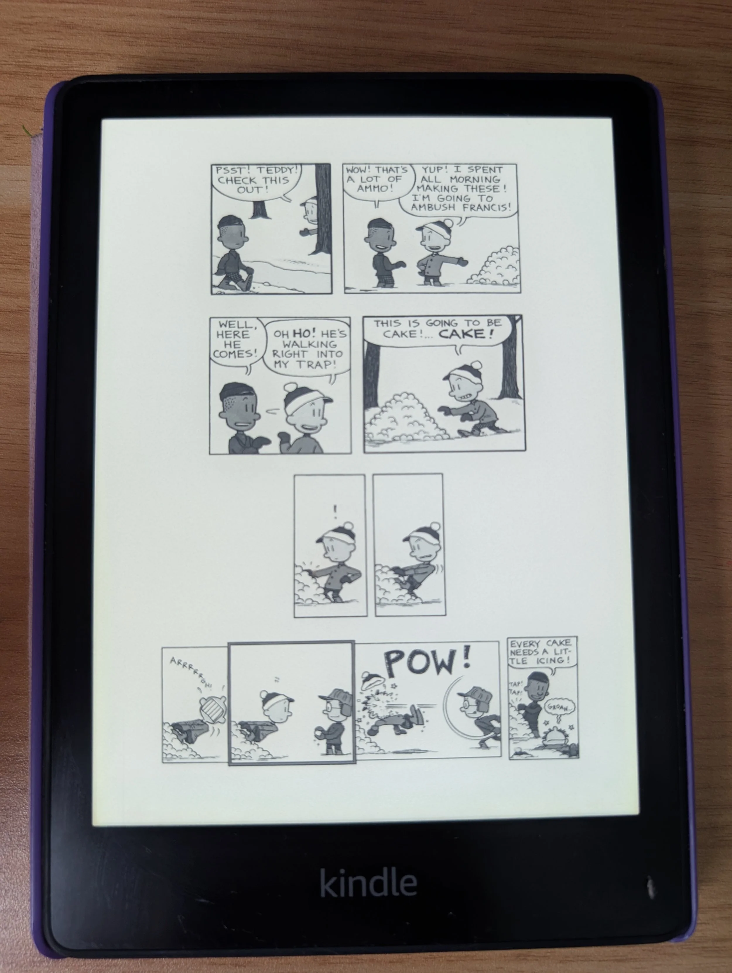
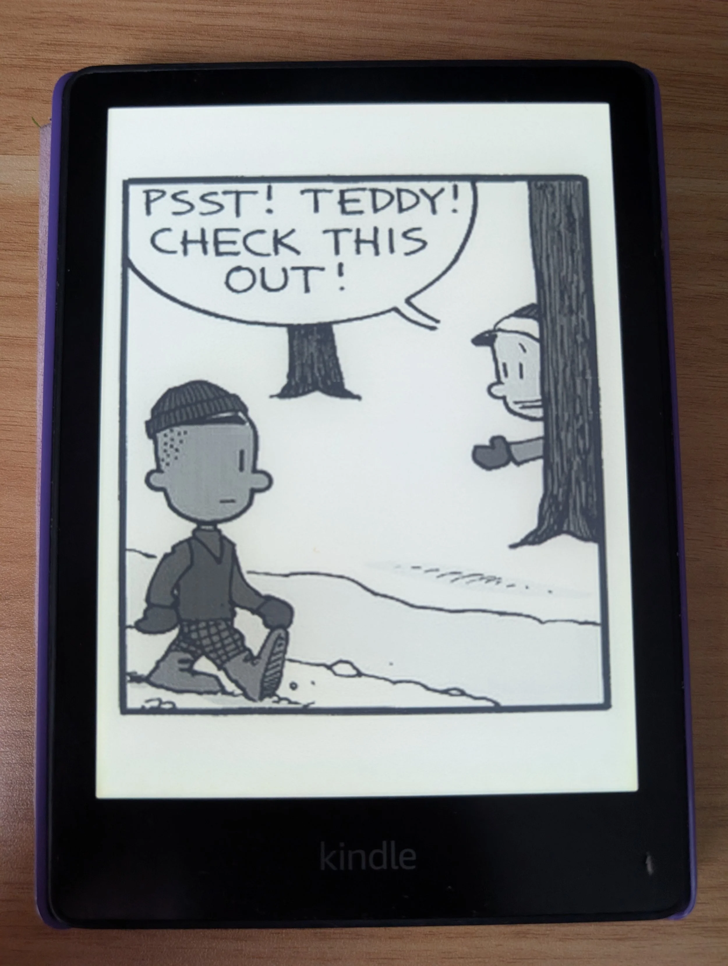
A screen recording of a Big Nate comic Kindle edition, showing the zoom in function in practise.
Priddy Learning – Let’s Learn Dyslexia
I spotted this book in the shop formerly known as ‘WH Smith’ (and I refuse to call it anything else, frankly) and was immediately drawn to it.
A whole book dedicated to developing specific skills that children with dyslexia struggle is something I love to see on shelf.
The parents tips are fantastic and informative, the pages are designed in a clear and uncluttered way. The use of colour is dyslexia friendly: black text on off-white/cream, blue or yellow backgrounds. There are specific sections dedicated to skill development: Alphabet Work, Phonological Awareness, Memory and Reading.
I also adore that the learning throughout this book encourages a multi-sensory learning experience; where the learning uses two senses at once to process the information, which can make the learning connection for the topic stronger.
One question I have about this book though is the font choice. From eye (though I am not very confident in my ability to identify fonts), it looks Century Gothic-esque, which is an accessible font. Good kerning, rounded letters and a clean uncluttered style. But I’ve always considered this to be a one size fits all font for accessibility.
Given that this is a book specifically marketed to children with dyslexia, why not choose a font developed for dyslexia too? Like Dyslexie or OpenDyslexic? So many times when considering accessibility in publishing, you can make a decision that works for some disabilities, but not others. I feel as though something is always compromised. White paper with black text is great high contrast, for those with low vision, but the page glare that a white paper can cause can be painful and distracting for those with dyslexia, for example.
But this book, marketed and for a specific disability does not need to compromise like this. Especially when a very common issue for many dyslexic people is character flipping, where similar letters can be mirrored – I would argue that the font used in this book is particularly lacking in this area.
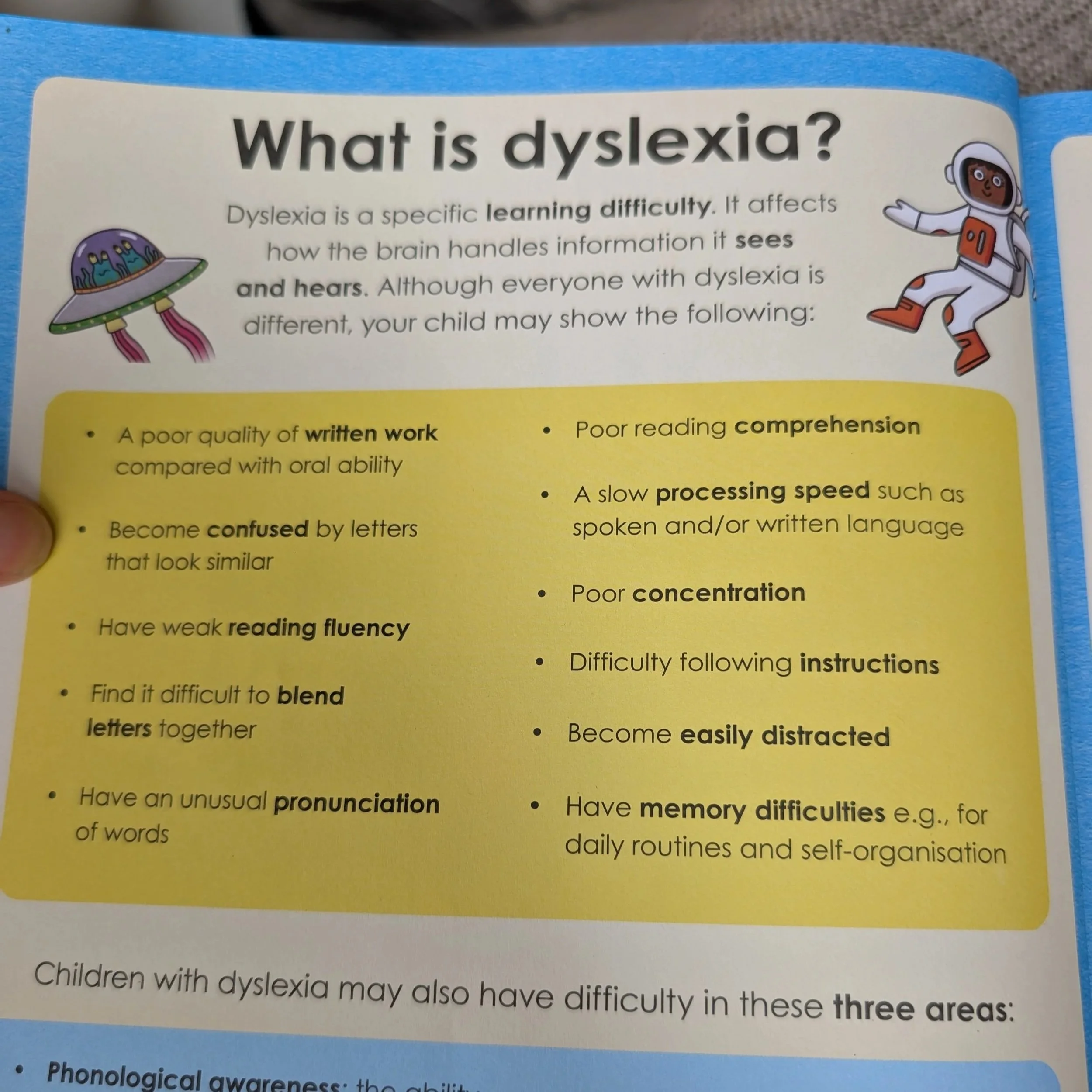
Priddy Learning, Key Skills For Kids, Dyslexia, page 2 – ‘Become confused by letters that look similar’ is the second point on the list.
Here are some example of where I think characters in the chosen font could be easily flipped or confused as the character shapes are very similar.
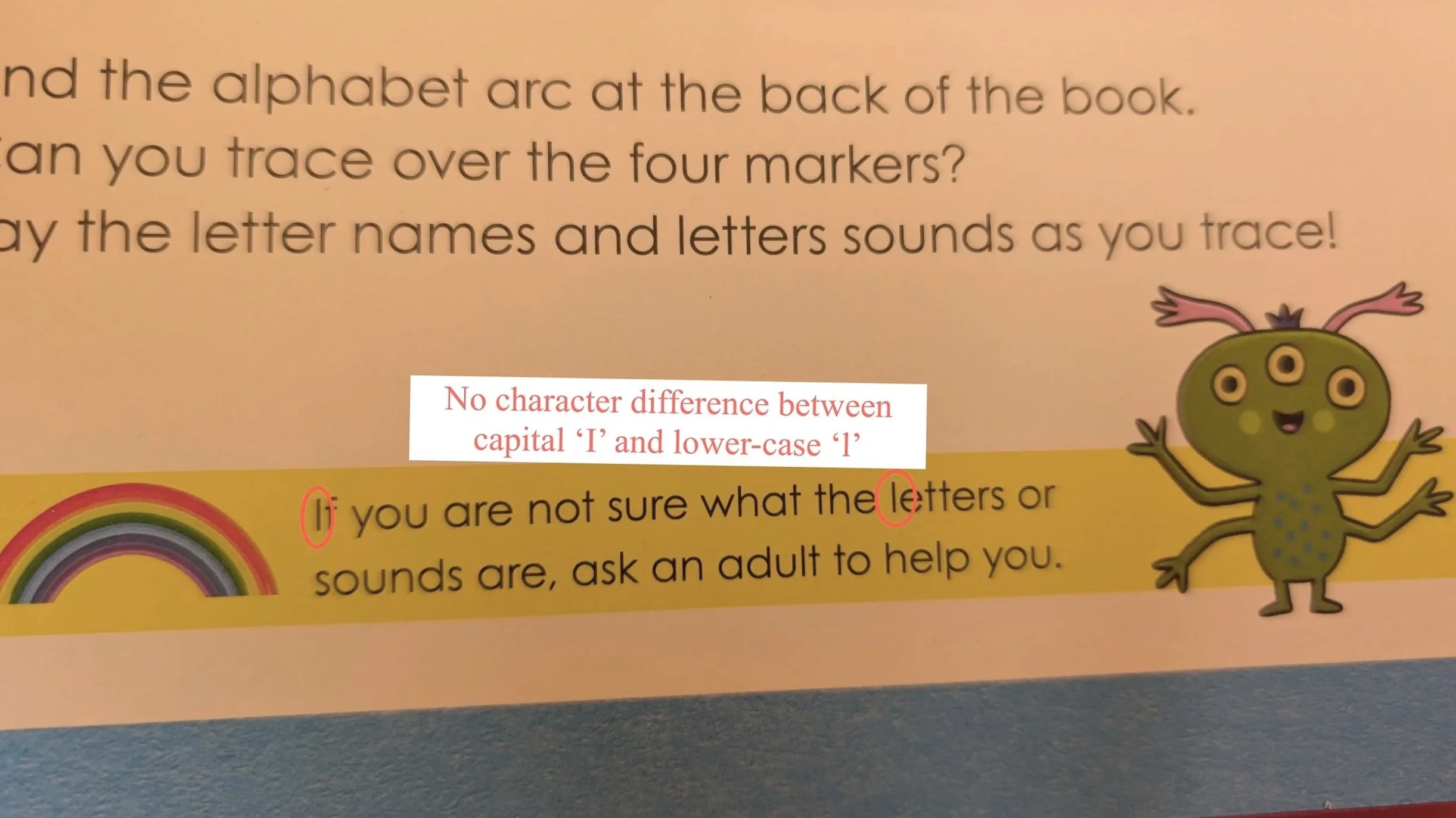
As you can see, the character shape for capital ‘I’ and lower-case ‘l’ are the same.
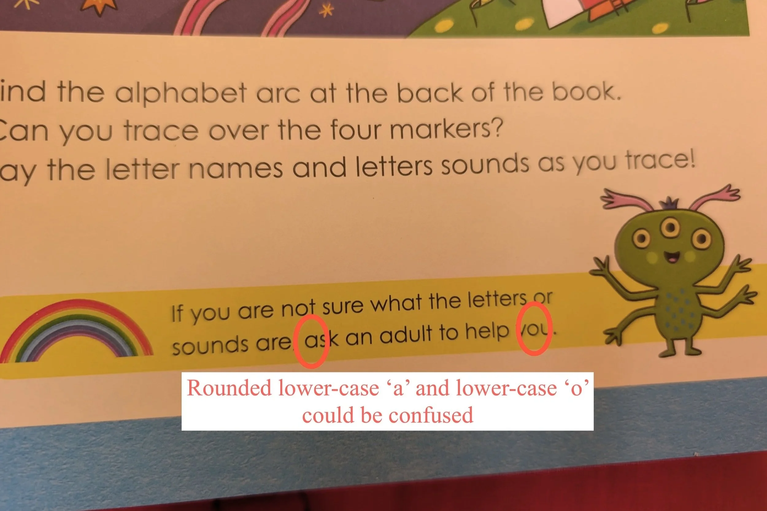
Due to the rounded and low-clutter nature of this font, the ‘a’ and the ‘o’ are very similar in shape and could be confused.
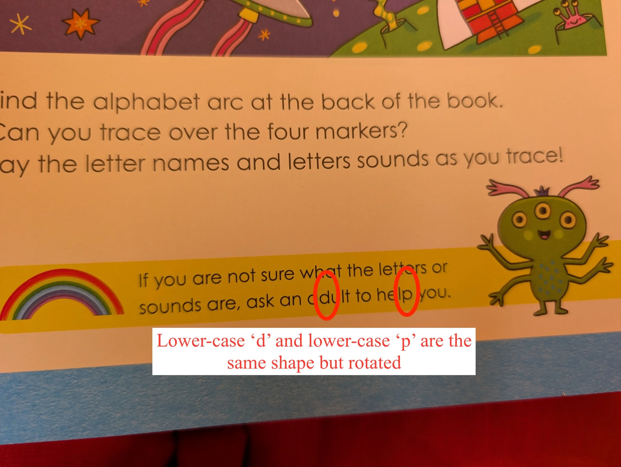
The lower-case ‘d’ and lower-case ‘p’ are the same shape, but rotated around. This is the sort of character that will be easily flipped around by the brain.
This book had two educational consultants who worked on this title, Rebecca Heyes and Kim Nau, so perhaps there is something I have missed about the font choice, or perhaps it was just series style of this range and perhaps that decision overrode any accessibility concerns. To me though, it seems a missed opportunity to ensure easy access to this book for those with dyslexia.