
Lost and Found, Oliver Jeffers, HarperCollins
Most of this book is very accessible, with the text on clean white backgrounds, but there are a few spreads where there there is room for improvement.
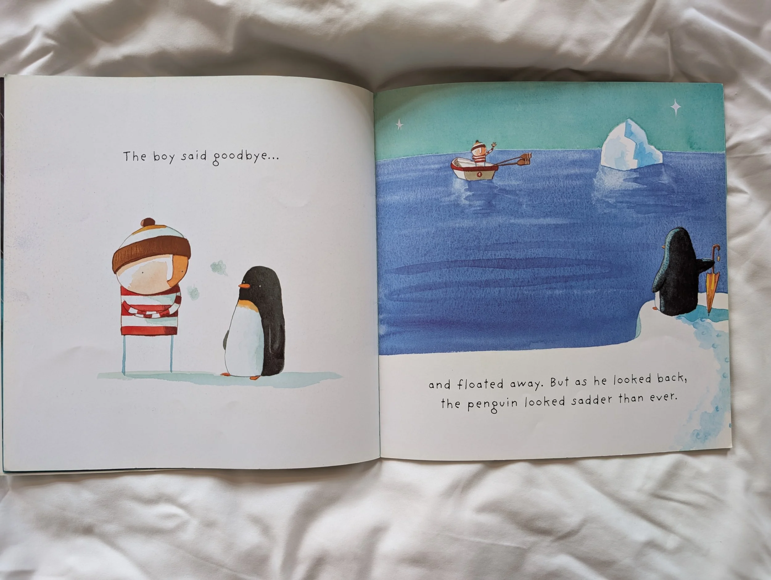
This spread works very well, and I particularly love how the the space to cohesive with the art as a whole on the right-hand page.
The text is nicely space, a good size and easily legible.
Accessibility amends I’d make on this spread
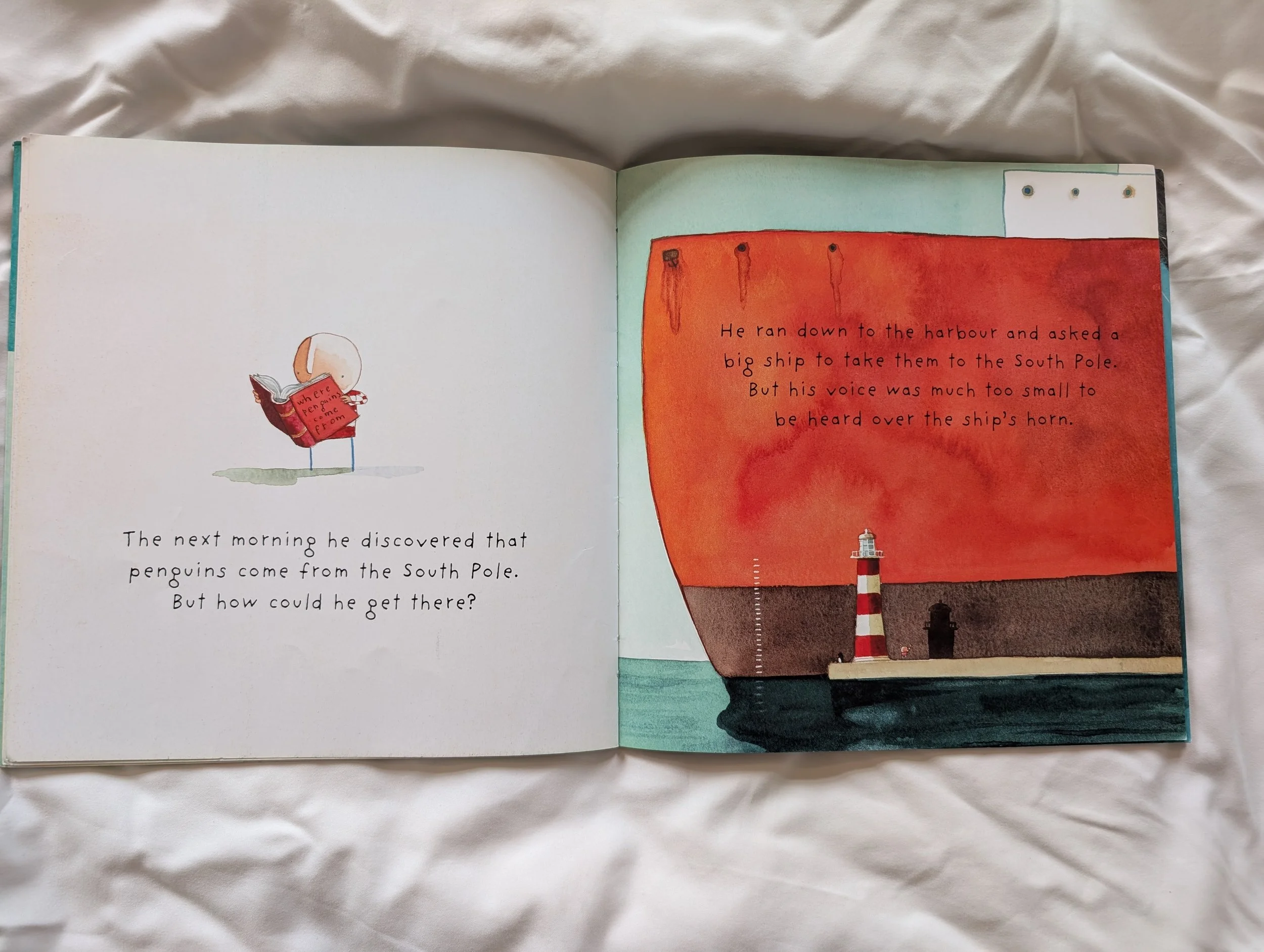
There are quite a few spread in Lost and Found which are
half-and-half for me. This spread, for example, I have no notes
on the left-hand page, but for the right-hand page, the uneven texture on the ship makes legibility a bit trickier than it needs to be. Space for the text has been considered and left, and it is aesthetically cohesive. The texture is part of Oliver Jeffers’ art style, but I would suggest reducing it entirely behind the text.
Accessibility amends I’d make on this spread
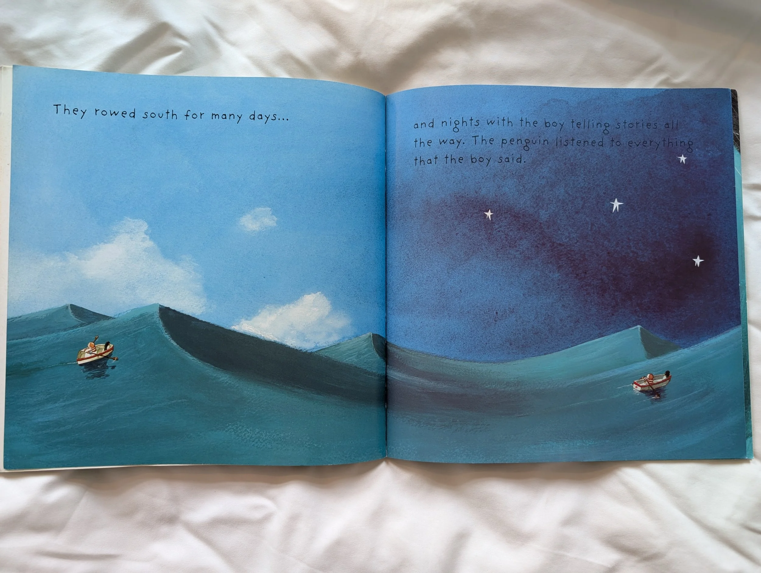
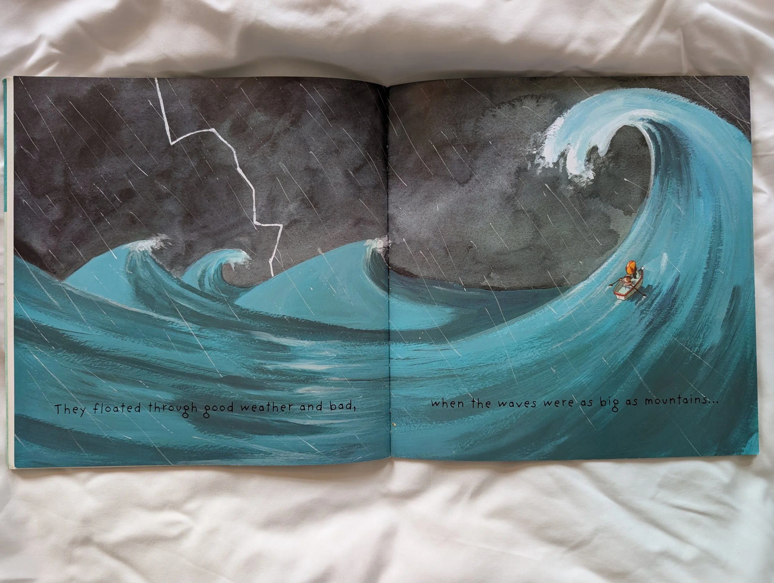
This spread is dramatic and aesthetically pleasing, but it’s hard work to find the text.
Not only is the black text colour a low contrast to the background, but the varied textures and colours behind the text increase the illegibility.
I know from experience that reading this page at bedtime at low light is nearly impossible. This picture was taken in full daylight, and it’s tricky to see the text.
As this is a book likely read often by parents at bedtime, or used as a book for a child in the early stages of reading, the accessibility of this page goes beyond different needs, and just becomes unfit for purpose. When over half of the use of a picture book is for the text to be read, having the text being difficult to read for the sake of the design aesthetic is an odd choice. A choice I’ve been involved in making in the past certainly, but that doesn’t mean we have to keep opting in to making the same choice in the future.
Changing the text to white might be an easy solve here, because the drama of this image being full bleed is really quite lovely.
Accessibility amends I’d make on this spread
The problems on the right-hand page of this spread are similar to the above spread. You can barely read the black text on the right-hand page, and it gets increasingly harder to read as you progress through the sentence and paragraph – which is frustrating for all who are reading.
There’s no doubting the aesthetic storytelling going on in this image, the transition of day to night aligning with the journey of the boy and the penguin. But you lose of overall enjoyment and appreciation if you are struggling to read or frustrated about it being illegible.
Again, white text would likely be the easiest solution here and would allow the page to keep the drama of the double spread full-bleed image. Alternatively, creating a white space for the text to sit above the image would also work.