Accessible Fonts
On a recent project I worked on, I could choose between two fonts for the body copy from a small style guide – one was a sans serif, thicker font with a slight italicisation with a tight kerning, and the second was a lighter roman font, with better kerning but had a non-educational ‘a’.
Educational ‘a’ made me think about my journey as an editor in choosing fonts for picture book layouts for 0–7 year olds (early readers). For a majority of my career, I have worked on licensed titles, where fonts often come packaged in a style guide. The fonts are often highly stylised, cool and aesthetic, often geared towards graphic art and marketing material and often, legibility in body text is not often considered. So very often in meetings with licensors, there came the inevitable moment in the meeting where we had to suggest an appropriate body copy font, and the importance of having a lower-case ‘educational a’.
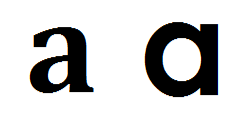
The ‘a’ on the left is known as a ‘double-storey a’.
The ‘a’ on the right is an ‘educational a’.
Looking out for an educational ‘a’ became one of the series of things I looked for and flagged when reviewing layouts. Later, as I learned about accessible fonts, particularly those fonts developed to help those with dyslexia, I learned about sans serif vs serif fonts for legibility, and, of particular importance with the ‘educational a’, letter mirroring and flipping.
For some people with dyslexia, their brain flips and mirrors similar looking letters, making reading challenging. I wrote about the font Dyslexie, which gives each letter a unique shape to help avoid this.
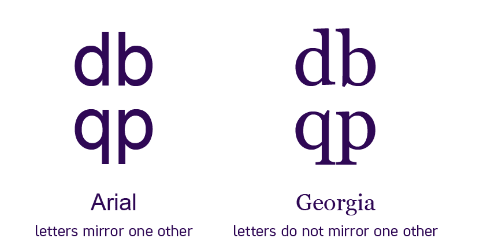
This illustration from scope.org.uk illustrates letter mirroring examples across two fonts.
To bring this back to my thinking about the lower-case ‘a’, the educational ‘a’ seems to be more easily mirrored than the double storey ‘a’ for instance. From the perspective of a visual impairment, an educational ‘a’ and an ‘o’ can be easily confused. And so, on my recent project, when I came up against the idea of using a body copy font with a double-storey ‘a’, whereas years ago, I’d have made a different decision, on balance, I was quite happy to use it.
The theory behind use of the educational ‘a’ was that it would be easier for young children who are learning to read, as that is the simpler version of that letter shape that they’ll be learning to write. I have seen that in action with my youngest son who is currently working so hard to write and learn to read, he more easily identifies an educational ‘a’, for instance. But this doesn’t then square well with my thoughts around letter mirroring or easily identifiable shapes for each letter.
Then I considered that perhaps this change in my perspective was because I have been approaching fonts from the perspective of being easy to see from a visual impairment point of view (as this is something I personally consider when it comes to my son). So I thought it prudent that I do some more research.
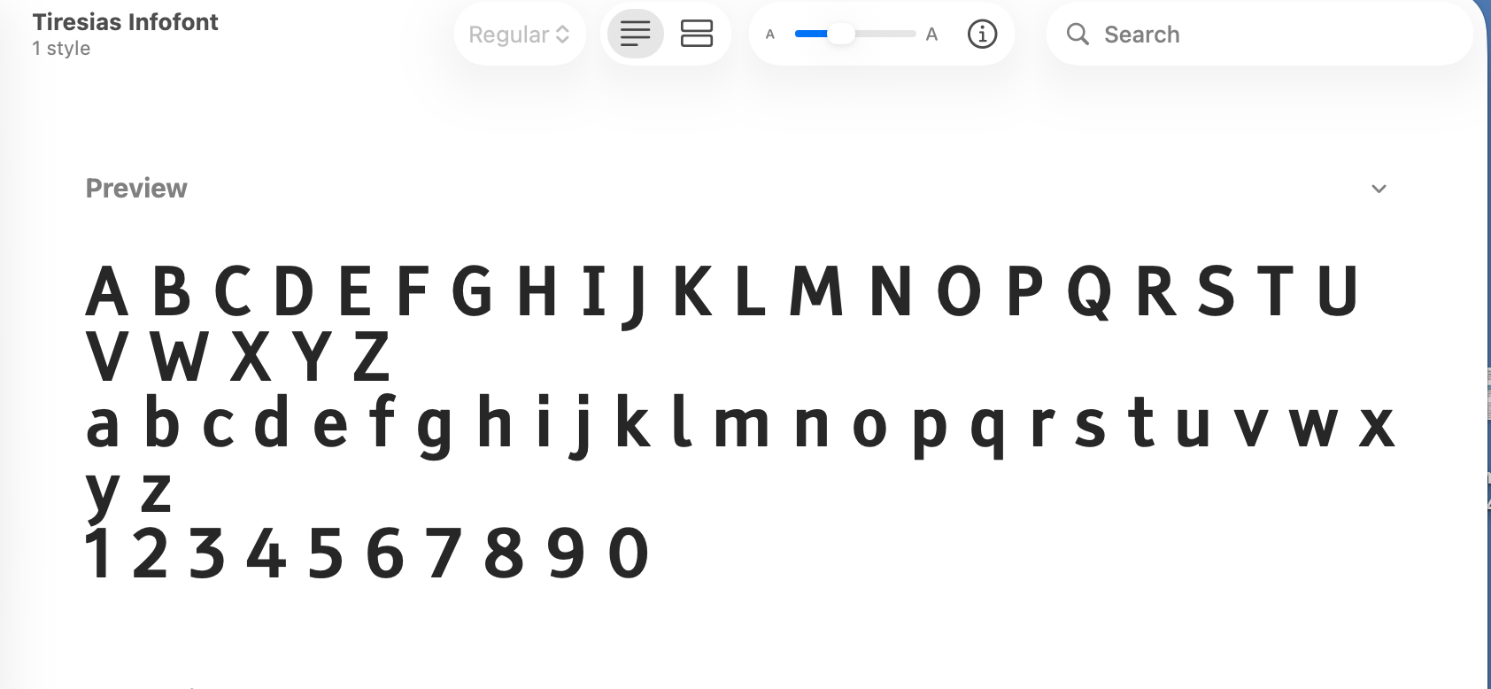
I found a font called Tiresias, which has been developed by RNIB for visually impaired readers. That uses a double-storey ‘a’, which is very interesting. Hazarding a moderately educated hypothesis for this, a visually-impaired person is most likely to miss the detail of the leg portion of the ‘a’ and might therefore mistake it for an ‘o’; the double-storey ‘a’ providing a more obvious point of difference that is more easily identifiable for those with low vision.
I used the Tiresias font when I did the layouts of my son’s book, Supersonic Kid, not only because serendipitously, I was researching fonts at the same time as working on that book with him, but also, if his very own book that we’ve made together obviously needs to be fully accessible to him.
The dyslexie font that I researched for a previous blog post, uses the double-storey ‘a’ as well.
And so with all this, I am actually a little unsure of how to hold space for these facts when they seem to sit in opposition to each other. On one hand, the accessibility points seem very clear to me, but as I have experienced with my youngest son, as a young child learns to read and starts recognising the shape of each letter, having a letter presented to them in two different forms can be confusing, but for those children without any visual, learning or print disabilities, the confusion is only momentary. Besides, every font I can see on the posters around me in my co-working space, and on all the apps and websites I have seen today, all use the double-storey ‘a’ anyway, so surely using it goes in some way to preparing children to read in a way they will have to day-to-day throughout their lives.
Case Studies
Meg on the Moon, Helen Nicoll and Jan Pieńkowski
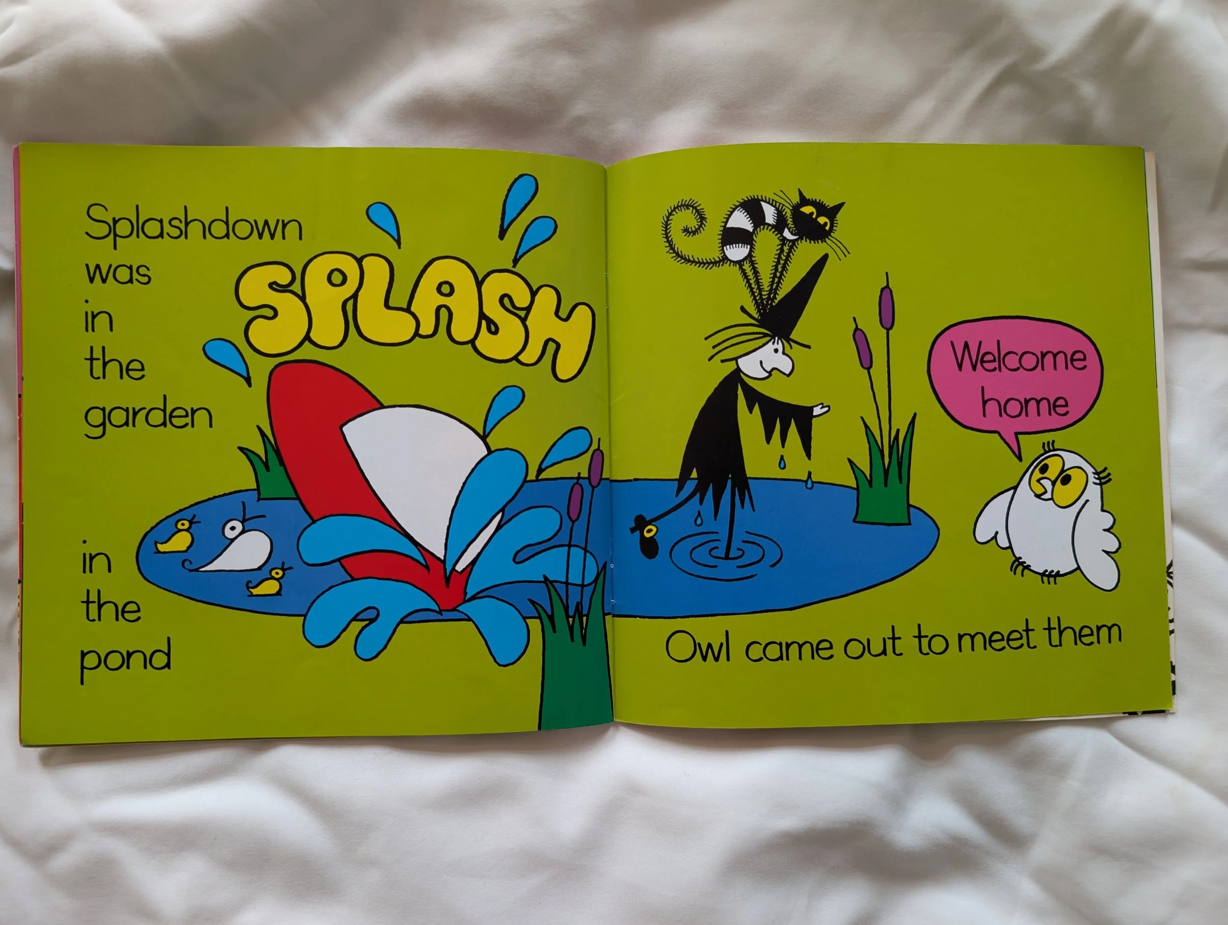
When I was searching for books my visually-impaired son who started learning to read from about 18 months old, Meg and Mog books were my go to. Not only for the single colour, uncluttered bold vector style of illustrations, but the text is clear and on a solid coloured backgrounds.
The font is clean and clear to see and the lack of punctuation also works to reduce visual clutter around the letters and let the child focus on the letters and words themselves.
The kerning is quite tight, but text size is good.
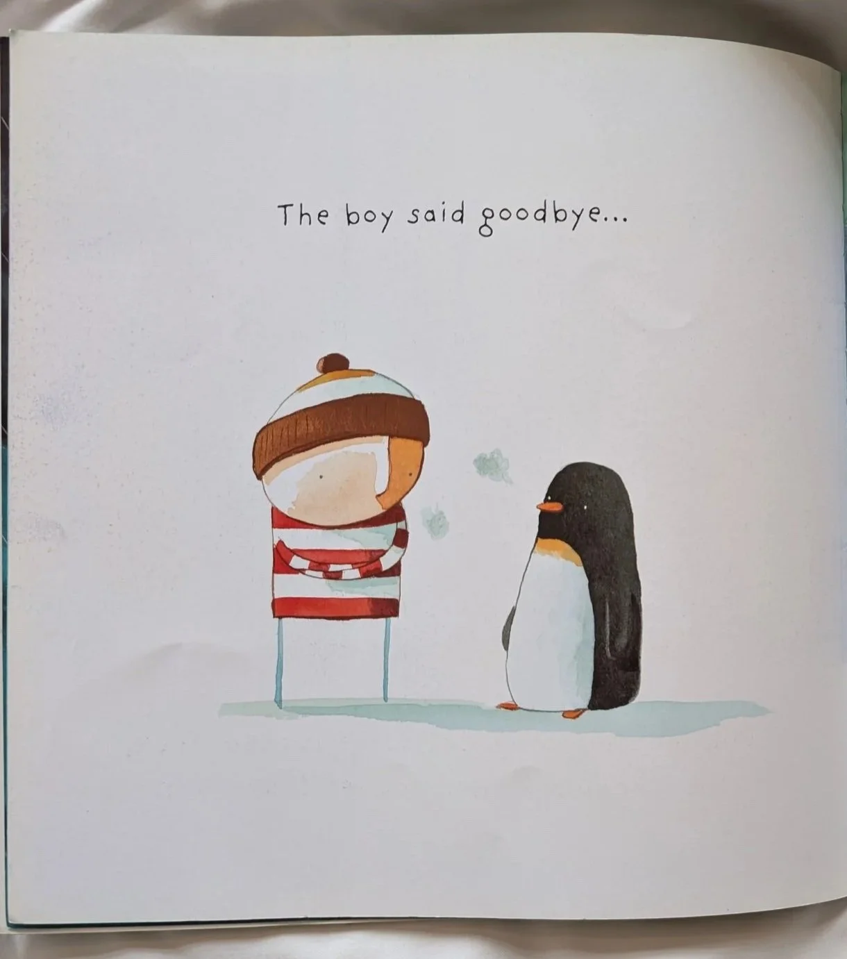
Lost and Found, Oliver Jeffers
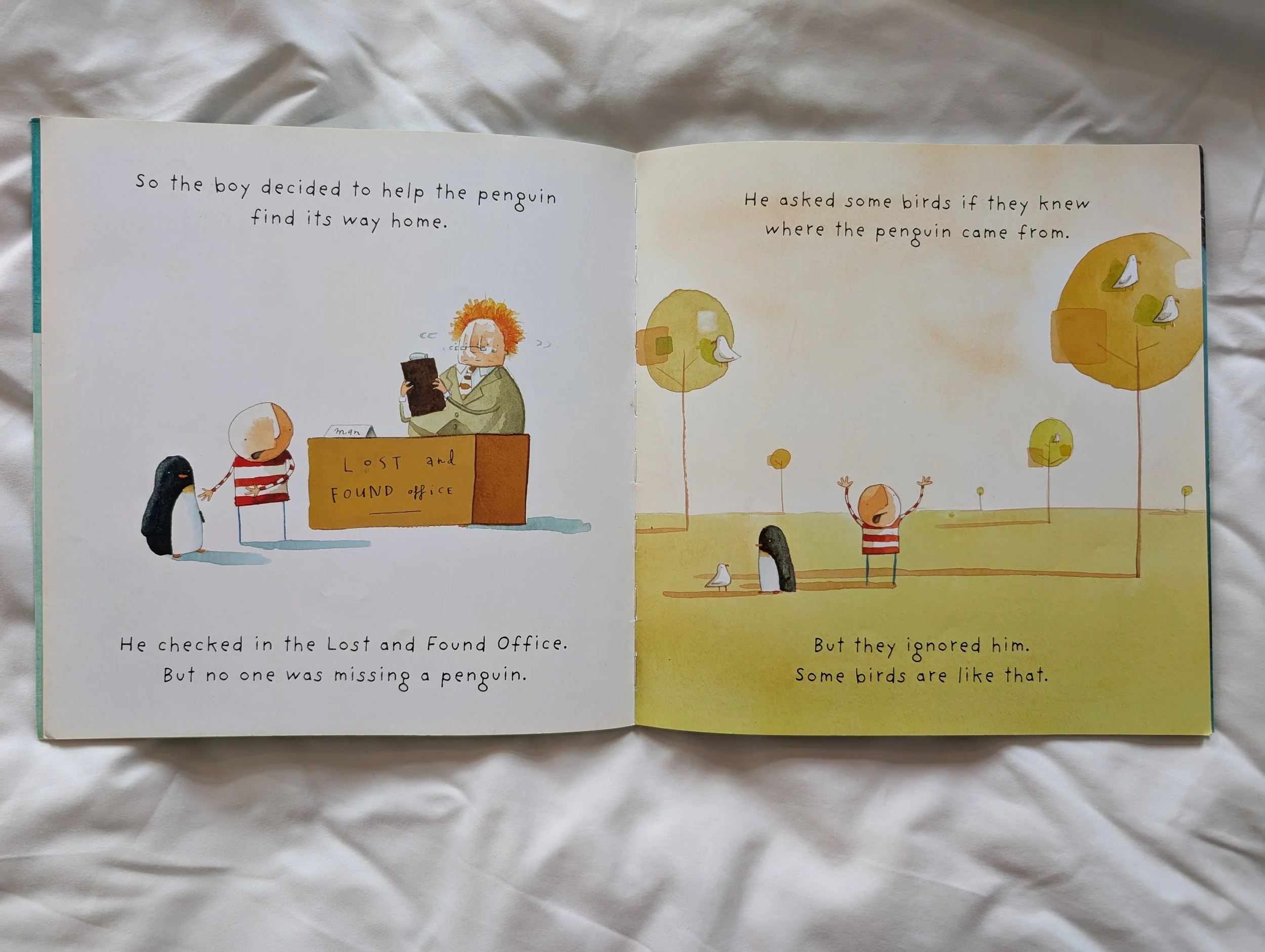
I love the stylised, handwriting font used in Oliver Jeffers’ books. The kerning and line spacing makes this font clear and easily legible. And the unique and non-uniform weighting and shape of each of the letters would, I imagine, go some way to preventing mirroring for some.
I think the stylised ‘g’ works quite well too, as it is so distinct from the ‘y’ so they are not easily confused.
Poo in the Zoo, Steve Smallman and Ada Grey
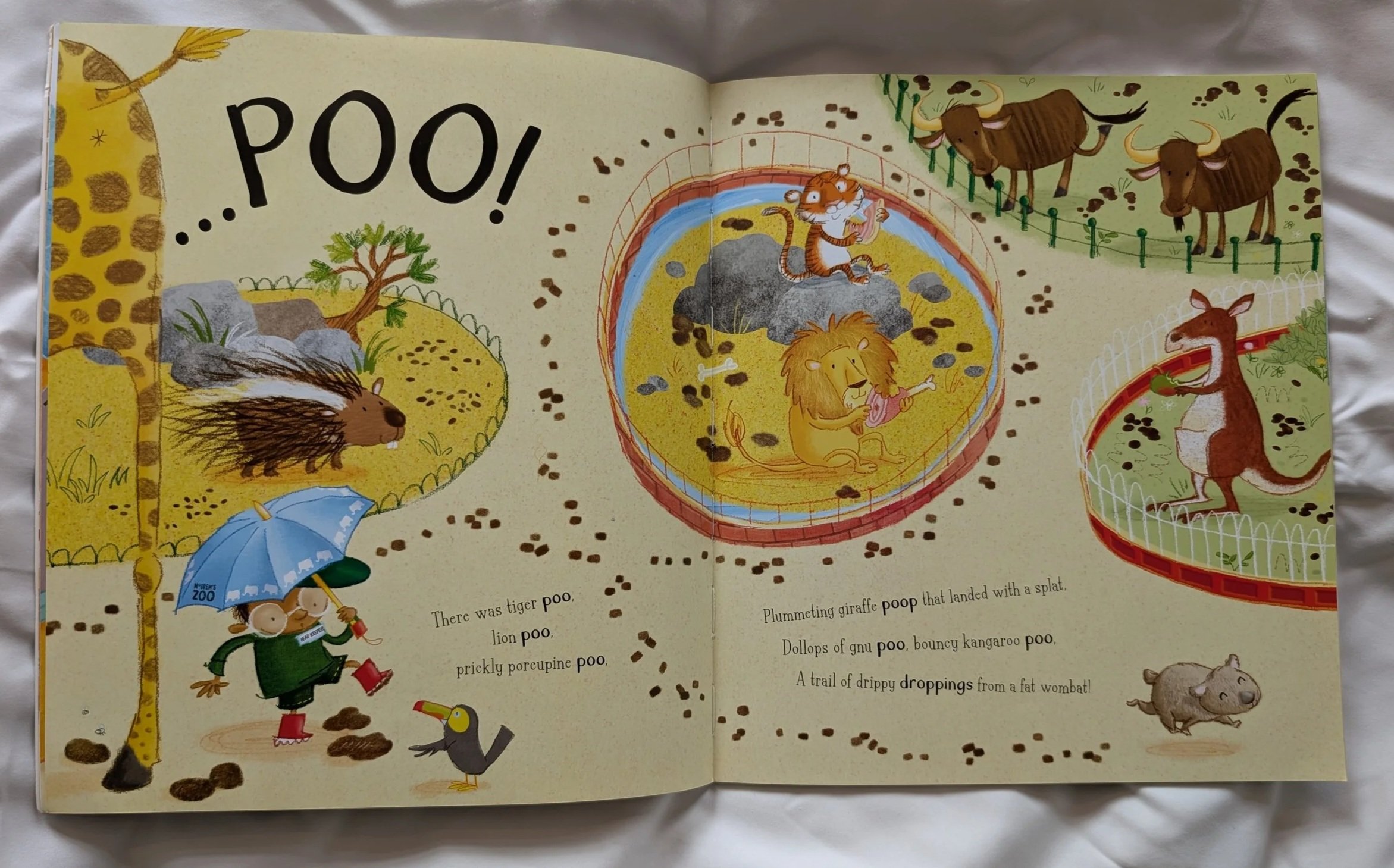
The jury seems split on whether serif or san serif fonts are more appropriate for legibility (a case study for another day, I think), the adage being that the most famous serif font, Times New Roman is so well-used for a reason. The rational behind the serif part of the font was that it aids to lead the eye smoothly from one letter to another, but I know from my experience with visual impairment, either the serif would be too small a detail to be seen or would provide visual clutter and add confusion in letter shaping.
The font chosen for ‘Poo in the Zoo’ is fun, but the overall irregularity and seeming unpredictability of it overall will be a problem for those struggling to read. Each line of text is positioned different angle, adding to the visual unpredictability of the text as a whole. When your eye or brain has to work twice as hard to read, look or absorb information, design elements that have been added to show fun and whimsy (as I assume was the aesthetic intention) actually add an additional barrier to experiencing the giggles and silliness provided by this book. I would suggest placing the body text angle to a straight line to make legibility easier, and would reduce the unpredictability for the eye overall.
There is such a lot of detail on the spread overall in the illustration, and along with the font and line angle choice, there is a lot going on visually. My suggestion would be that the detail and visual clutter should be within the artwork, and then the text body simpler and easier to follow.
There is also a consideration to be made about placing text within a busy image like this. For those who find it difficult to focus, guiding the eye to a clean, clutter and predictable space is crucial, so they can spend their energy more easily enjoying the rhyme, metre and silliness of the story.