
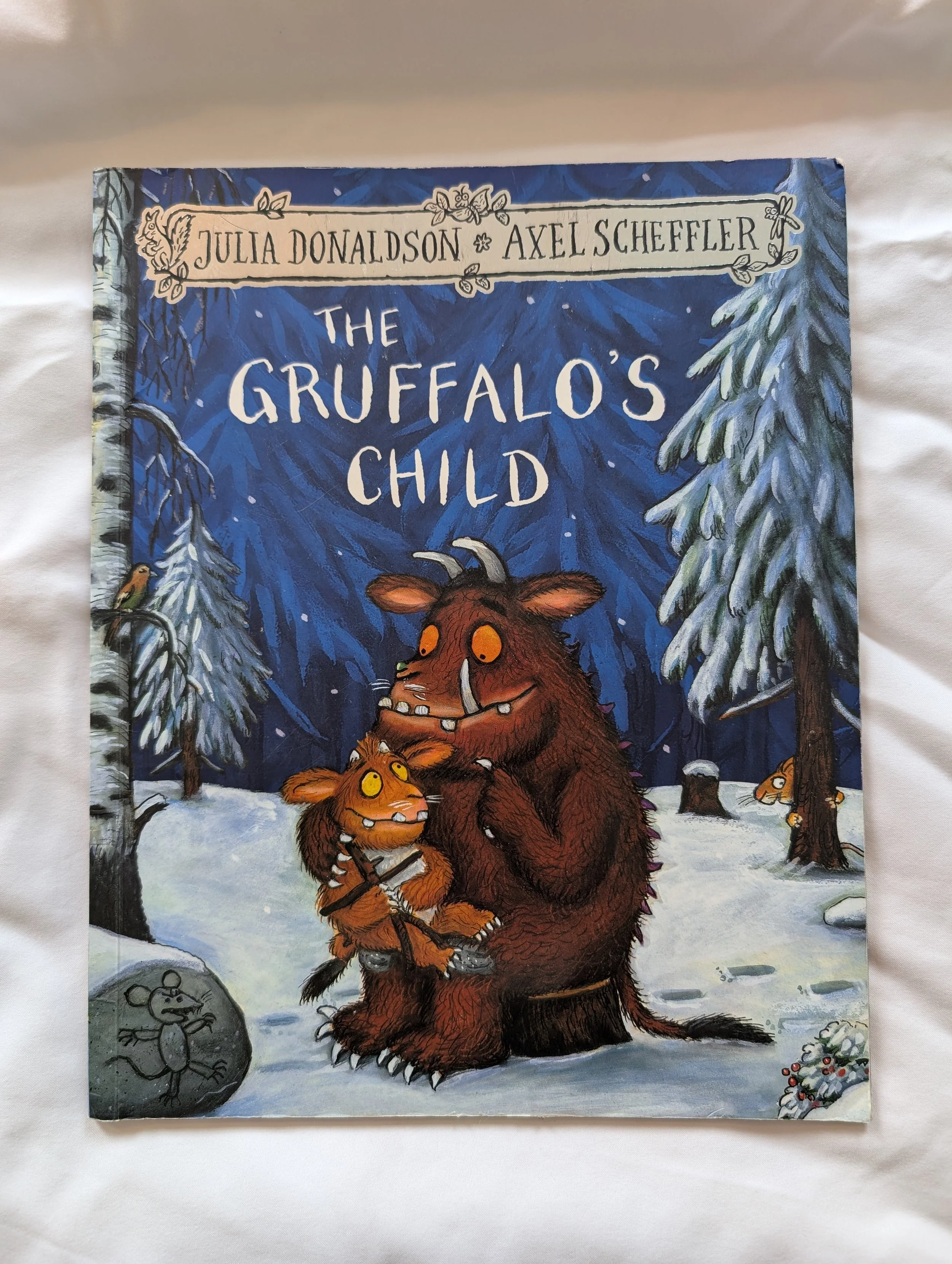
The Gruffalo's Child, Julia Donaldson and Axel Scheffler, Macmillan
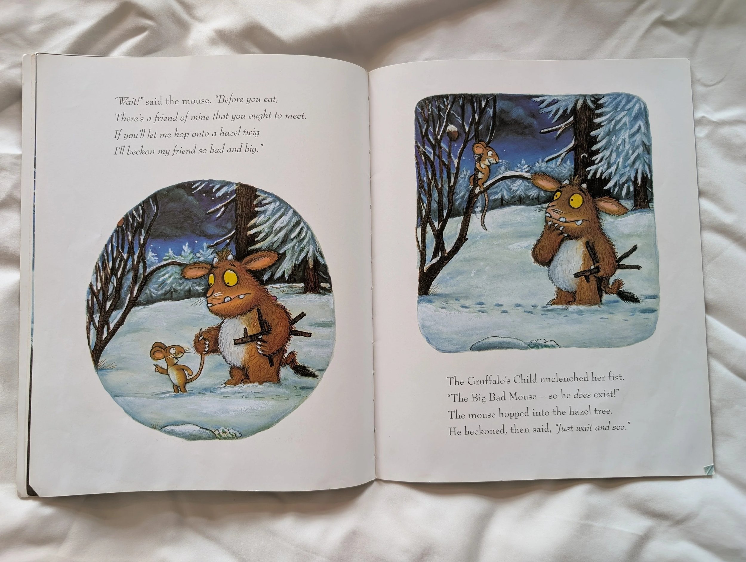
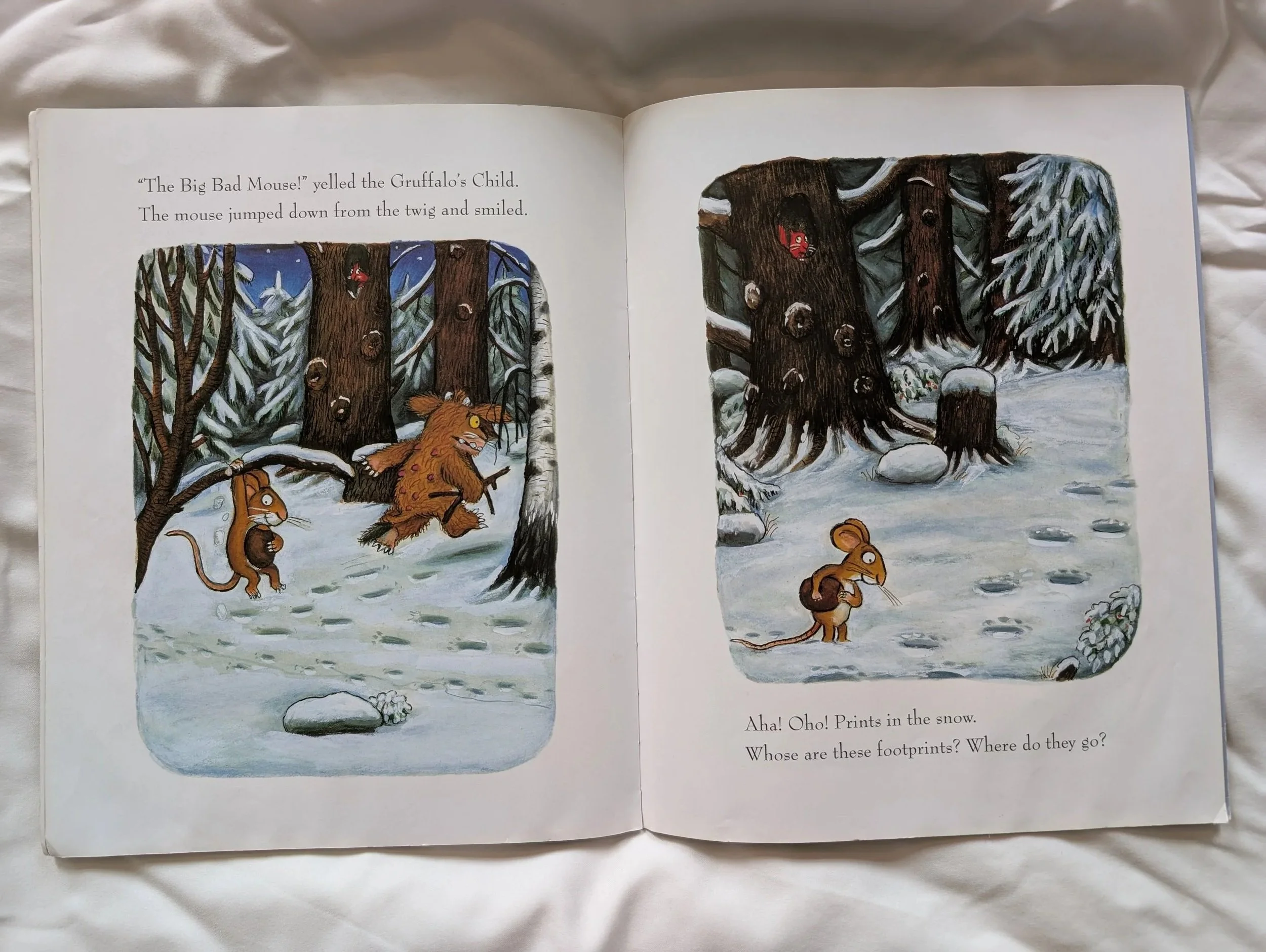
Most of this book is very accessible, with the text on a white background, great line spacing, space around the text with the images in vignette. Very visually uncluttered and the text and the picture placements follow easily from one to the other. Everything is in an expected place.
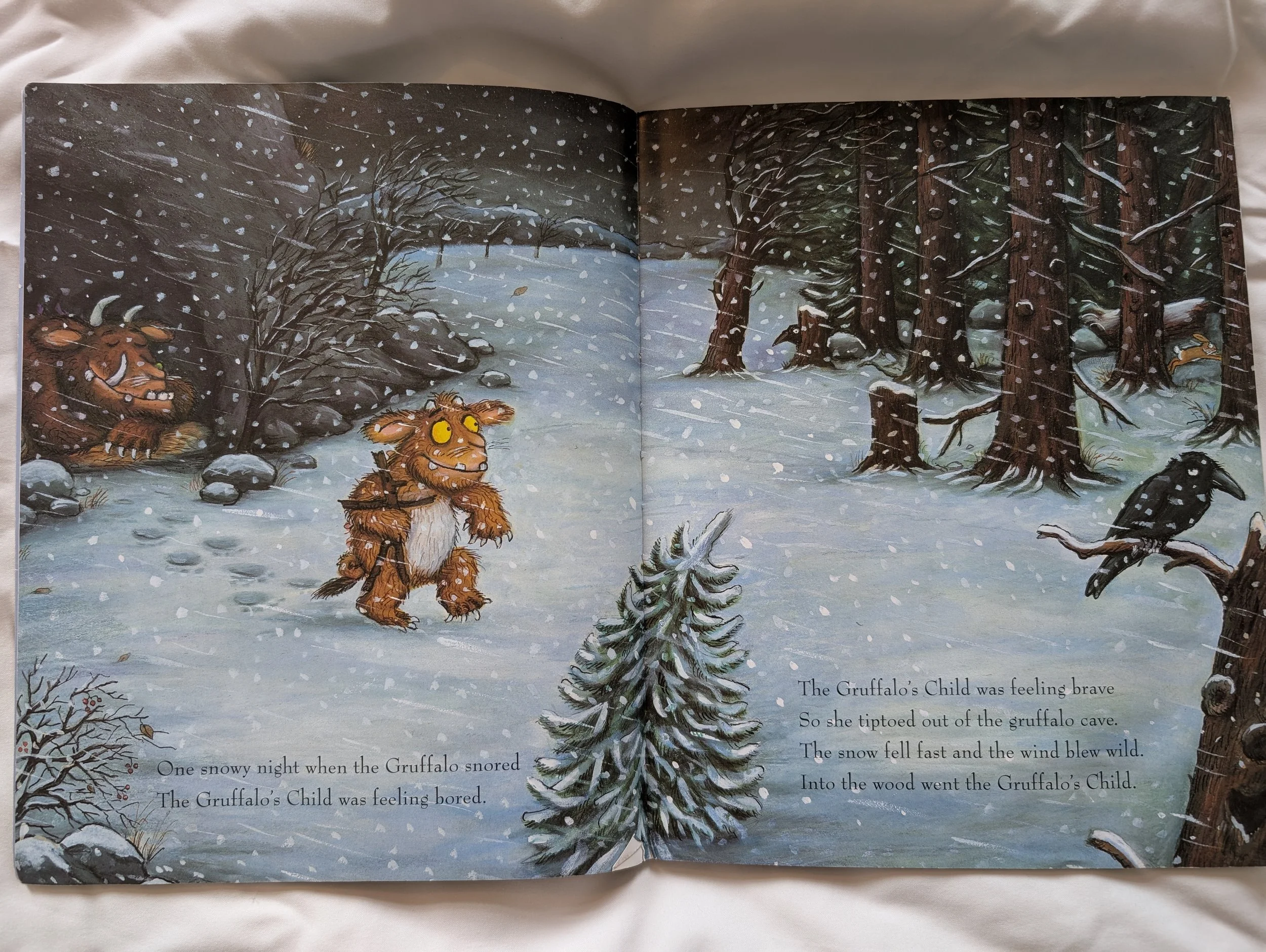
The following spreads aren’t easily legible for someone with visual impairments or other print disabilities, but there are a few very easy tweaks that could be made to make the text easily legible for most people reading the book whilst still looking beautiful, incorporating the artwork and offering a variety of page layouts, so the whole book isn’t just vignettes on a white background – because who doesn’t love a full bleed image!
One note to consider with full bleed images is that for those who are visually impaired, or have issues with eye tracking (how they move their eye about a page), full bleed images can be tricky to navigate. When your visual field is limited or if eye movement is a challenge, the whole image might not be able to be seen in one unconscious and fleeting glance. Looking over the whole image will take effort, physically (by moving the head) or by consciously moving the eye across the page. This is not something that can be changed here, but I remember when I learned about this, it really changed my perspective on how I approach layouts while editing as I consider what calls to the eye and how the eye might move across the page.
Accessibility amends I’d make on this spread
The texture of the snow falling and the various shading texture behind the text are both competing in the same space, taking the attention away from the text and the ability to read it. The black text and background are low contrast as well, which increases the difficulty to read the text.
My suggestion to amend this would be to remove the snow textures from behind the text, and make sure there is a plain colour background (in a snow colour) behind the text. The art could be tweaked around the text to ensure the full bleed image flows into the text area, making sure it is all in-keeping with the art and full bleed design, and ensuring enough room is given to the text space to allow for co-edition translations.
I see spreads like this all the time in picture books, where the priority is the art over the text at the expense of legibility. In the case of The Gruffalo’s Child, I see two other issues with including a spread like this that aren’t anything to do with accessibility. As a children’s book, it is either read out-loud by a parent at bedtime where the lights are likely dimmed, so a low contrast between the text and a textured background will be difficult for an adult with 20:20 vision to read. But also, as a beloved children’s book with rhyme, metre and a fun story, it’s the perfect story to read with a child who is just starting to read and recognise letters. In the early stages of reading, where their brain is focusing on recognising each shapes’ outline, any visual noise and texture behind the text adds an unnecessary barrier to reading, causing frustration in their effort to read and removing enjoyment.
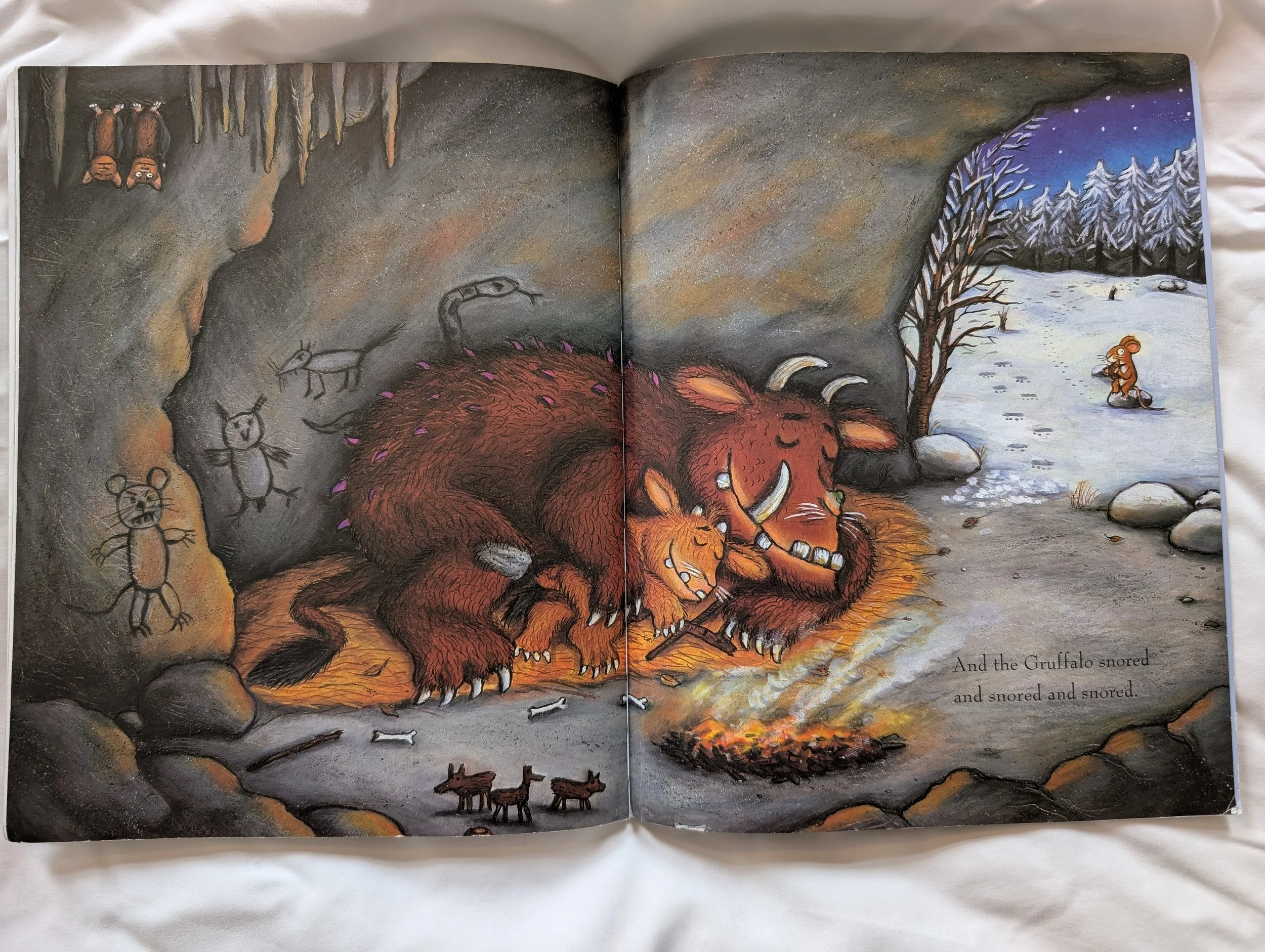
Accessibility amends I’d make on this spread
If you take a moment to relax your eyes while looking at the above spread and look at it as a whole, it is easy to miss where the text in on this page altogether.
Black text on a grey background, textured with shadows is extremely low contrast. This photo was taken in full light and it’s still tricky.
My suggestion is to remove the shadows behind the text space and have a space made in the art that is a solid colour. If the colour still has to be grey (art could be amended to extend the smoke from the fire, for example, then the text background could be white, but art amends like this aren’t always possible on such iconic art) then I suggest changing the text colour to white. If for print reasons, the text needs to be black text, then reduce the saturation of the grey behind the text to allow for as much contrast as possible.
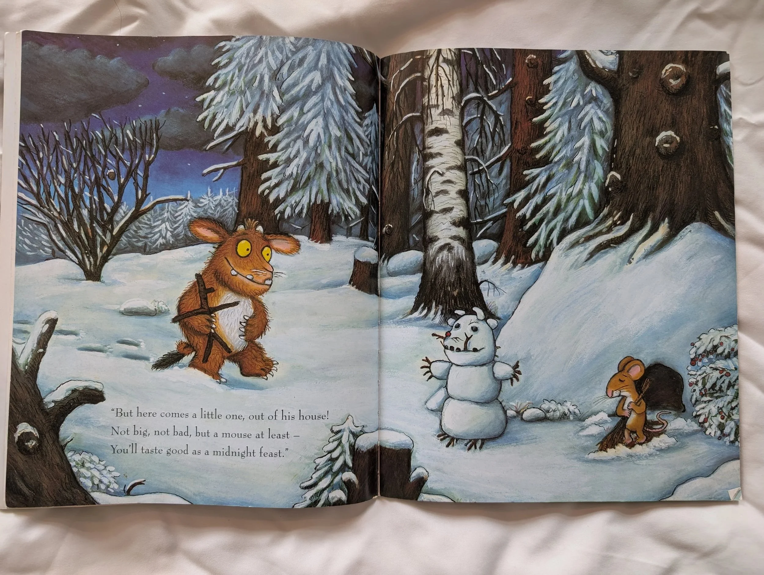
Accessibility amends I’d make on this spread
This spread works quite well as it is; it is much more easily legible than the previous two examples. I would suggest reducing the texture behind the text even more (especially the shadow behind <<You’ll>>), and allowing a little more visual space around the text, as the tree stumps are quite close and it is a little visually cluttered which might cause issues for eye focus.