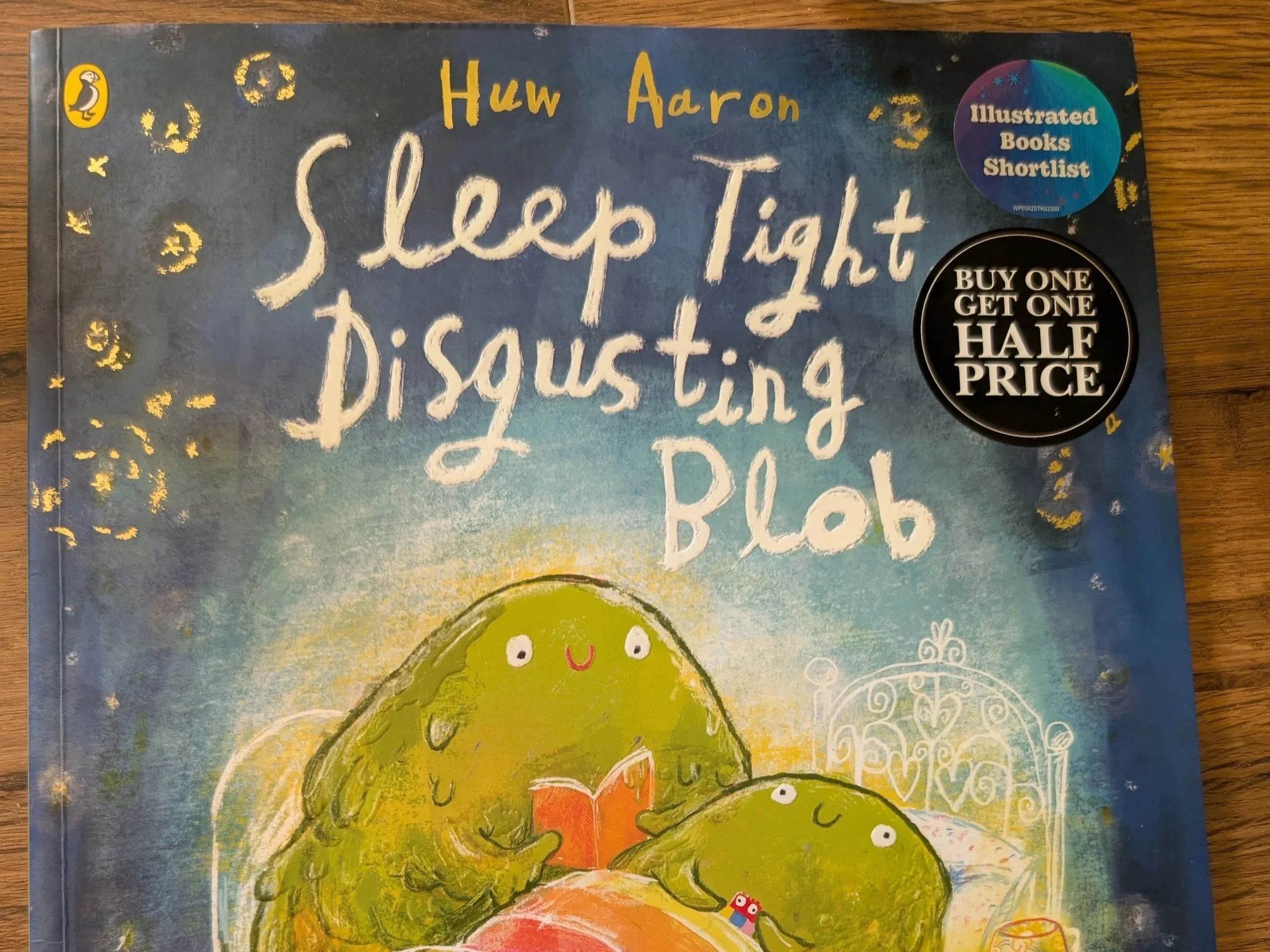
Good Night Disgusting Blob, Huw Aaron, Puffin
This title won the Waterstones Illustrated Picture Book 2026. We bought this book for our youngest son as he picked if off the shelf because of the ‘cosy bogies’ on the cover, which made him laugh hysterically. (Loves a good disgusting, gross joke, that boy!) I hadn’t even got to the till before I spotted multiple accessibility issues.
Both my children absolutely love this story, giggle at it endlessly and ask for it at bedtime often. It has become, as is common in our home due to the amount of accessibility issues we encounter with picture books, a book which we read aloud, as our eldest son struggles to read this to himself at bedtime. It reads aloud very well, and it is very fun, silly and imaginative. Our youngest son adores the illustrations and the silly details. When I filled in his Reading Diary for school after the Easter Holidays, this was the book he was most excited to write down that he had read – it’s a loved book in our house.
Which makes what I detail below quite heartbreaking, for not only our home but also for other families across the world with various accessibility needs.
The story covers 26 pages. I found an accessibility issue on 13 pages, which means that 50% of the book is inaccessible.
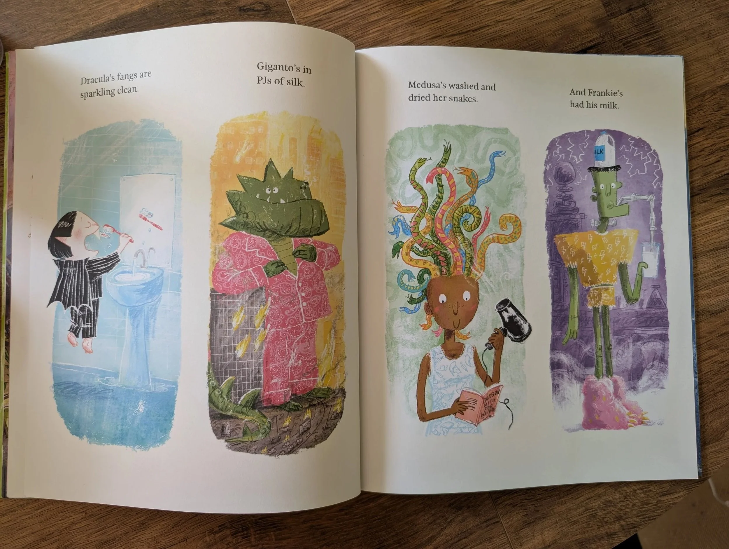
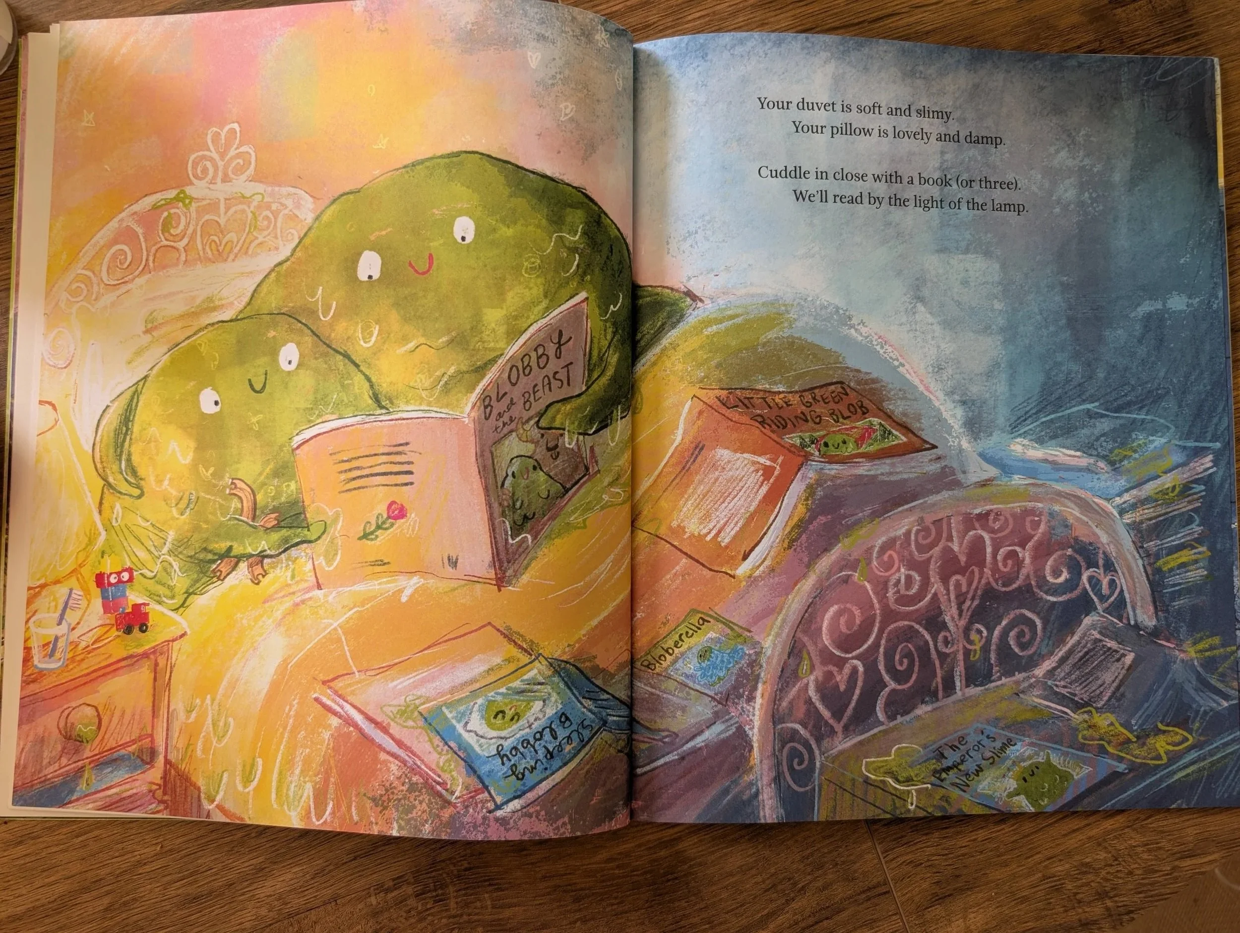
Some of the pages are laid out in both in an aesthetic and whimsical way, whilst also being accessible, include (but are not limited to) this one. Where the images and its related text are set out in columns, with the text in a predictable place above each image, each left-justified. The text is in a traditional picture book serif font, which has decent spacing (though the ascenders in ‘fl’ in this font are too close, but this only occurs once in the book).
The illustration style is gorgeous, the humour is immaculate. The spreads listed below are examples of some of the issues I found in this book, but is not exhaustive.
Accessibility amends I’d make on this spread
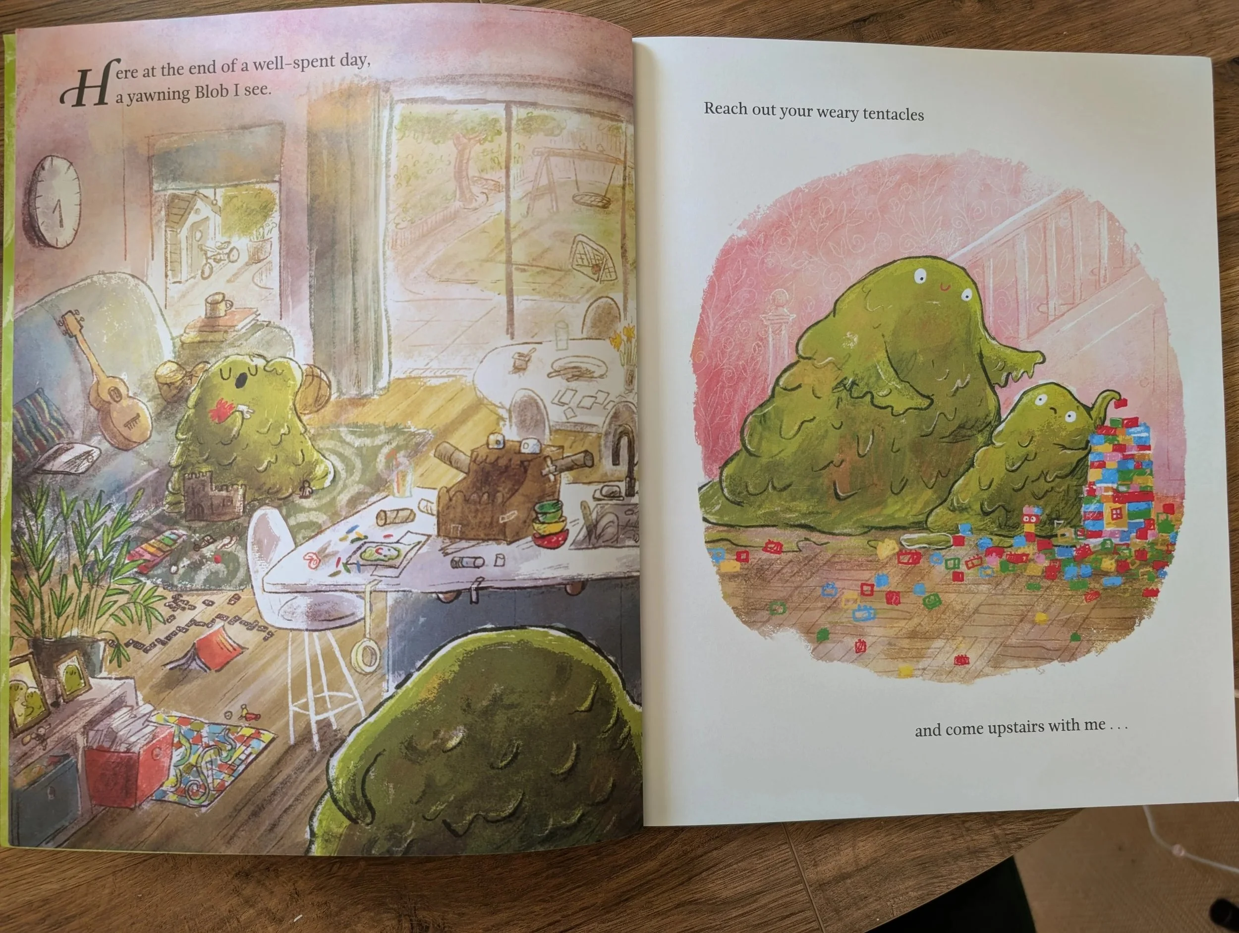
The spread above is the first spread of the story. The first thing I noticed as the drop cap on “Here”, which is what it is called when the first letter of a book is large and stylised in this way. It’s a very traditional typographic marked used in book publishing, but is discouraged in accessibility terms, as it breaks up the flow and word recognition, giving frustration from the very first letter of the story. In digital accessibility software, any drop caps are automatically removed to improve readability.
The text on the left-hand page is on top of a textured background, which decreases legibility hugely, as well as not leaving much visual space between the text space and the large and detailed full bleed image, creating visual clutter. My suggestion here would be to create a designated text space in the top corner of the page, with the texture behind the text to be removed, and text appear on the single light-pink colour. I would suggest increasing the clear space around the text slightly, the curtain pole is slightly too close to the text to be comfortable for the eye.
On the right-hand page, the breaking up of the sentence is an issue, as the flow is interrupted mid-sentence; though the metre and poem-like structure of this book as whole lessens this overall.
I would suggest the following considerations regarding the positioning of “and come upstairs with me …” to the left in this way: for those who are visually impaired, or have other print and cognitive disabilities, predictability of text positioning is paramount. So if you have been told that text starts from the left-hand side, you would start looking from the margin on the left, and have your eye travel almost half the page before it finds the text to start reading. And for those with focus difficulties or eye-strain, they are wasting crucial energy finding the text before they even start to read. Add to this that this is the middle of the sentence and you can start to appreciate the level of frustration this might cause.
Accessibility amends I’d make on this spread
If I had a pound for every time I came across this same issue in picture books, I’d be a wealthy woman. It’s such a common issue, and it’s one I have found in books I’ve written or edited myself. But, if I can achieve a single thing for accessibility in picture books, it would be this:
Stop putting black text on blue backgrounds.
It’s low contrast, and as I constantly say, it’s difficult for adults with 20:20 vision to read pages like this at bedtime, in the cosy glow of a bedside lamp at the end of the day when everyone is tired.
Given that this is a book designed to be read by parents and children together at bedtime, the dark blue colour scheme and aesthetic is expected. The art of the book reflects the situation and environment of the readers which is beautiful and an important aspect of picture books.
But, I believe, not a lot of time is spent while picture books are being developed thinking about the environment and physical experience of reading these books. So let’s do that together now.
When will ‘Sleep Tight Disgusting Blob’ likely be read? In the evening at bedtime.
Where will readers likely be reading this book? In bed (as depicted on the front cover).
Describe a typical bedtime scene. Cosy, low lighting, night-time, dark.
Thinking of the book in the environment the book will most often be read has a profound shift on the aesthetic and practical decisions of the book as a whole. A book designed to be read together at bedtime, as a cosy, comfortable, bonding experience should be completely legible in that environment, and black text on a dark blue gradient and textured background will be barely legible for most, if not all, readers in bedtime low light. In this way, the book is unfit for purpose, not just in accessibility terms, but practically. If the text of a book can’t be read in the most common environment it’s likely to be read within, then what’s the point of having text in the first place?
Accessibility amends I’d make on this spread
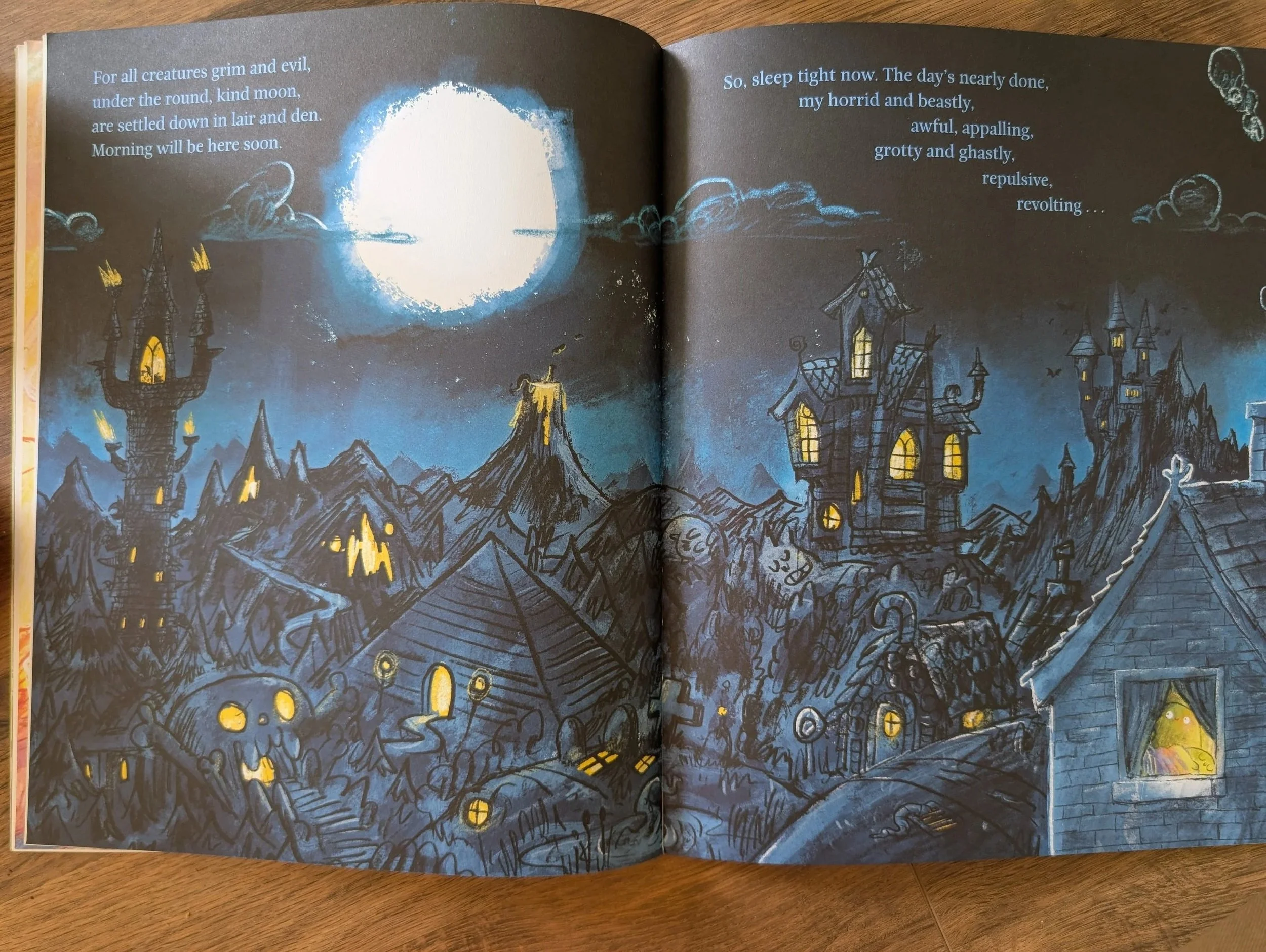
When I reflect on some of the decisions just like this I’ve made during my career about text legibility on a night scene full bleed, I remember that there were times when the book was set-up as black text only due to co-edition printing and budget constraints.
Given that the text on this page (and only this page) is blue, this is not the case. I can see that thought was put into the legibility here. Though my suggestion would have been to go with white text for a bigger colour contrast and legibility. The white wouldn’t have looked so out of place, I think, given the white brightness of the moon and the clouds in the sky.
But blue text, even light blue, on a dark background would be impossible for people with various needs to see, for example, those with colour blindness or those who can only see in high contrast (like my son). On the photo I took above (indoor, morning light) it looks clearer than in print on the page, where it is not as clear to the eye.
I have been thinking a lot recently about the impact that digital design and digital proofing practises and the impact they have on colour design like this. This spread when designed, edited and proofread on a backlit screen, the light blue text on the dark background will have looks legible and clear. But printed pages, are not perfectly backlit or even perfectly lit. I am not sure about the print check process at Puffin in 2026, it might still check wet proofs in-house, but from my experience, the trend in publishing has been to use digital proofs during print checks – for ease, speed and budget concerns – which is a positive change overall in my opinion, but it does mean colour considerations aren’t made around the printed page, but rather the digital one. Even screens with colour grading aligned with the printers can’t fully reflect the page, which I believe, leads picture book designers and editors to make decisions on colour that make the books more inaccessible.