Accessibility and short attention spans: 2 Problems, 1 Solution?
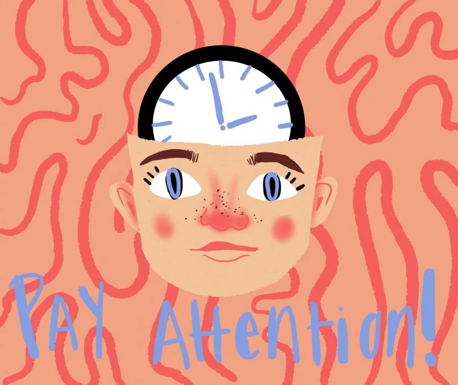
Cartoon created by Katie Kerrigan
For the publishing industry, last week was the Bologna Book Fair, and I saw a lot of think-pieces and other content from various publishing insiders; one that I saw over and over again was the concern over the reduction in children’s attention span and how that is affecting the industry as a whole.
In particular, I saw a story from Bright Agency’s Instagram page discussing how illustrators are adapting to accommodate for children’s overall shorter attention span and what struck me, like a lightning bolt from the sky (but slightly less dramatic): I think there’s an approach for children’s picture book publishing that can support both a child’s low-attention span in 2026 and increasing accessibility at the same time. A win for all sides, especially for the children who will enjoy all the benefits we know that come with becoming regular and life-long readers.
Like it or not, and I oscillate wildly on this opinion, one thing we know social media, in its various guises, is particularly excellent at is grabbing your attention and holding onto it. It is loud and makes focusing on it easier and more attractive than anything else. We’ve all experienced this – it’s easier to doomscroll than do literally anything else.
There’s not much we can transfer from social media in this regard into children’s publishing, but I do think approaches could be adapted so that how a reader actively focuses on the product in real-time and how their attention is attracted and works across the page is considered at the beginning of the book development process.
How attention and focus works across a page, and a product as a whole, is, I believe, a helpful tool when considering accessibility for picture books. A thought process I go through when accessing the accessibility of a spread, is that I imagine that my attention, focus and eye movements all take huge amount of effort. I focus on where my eye is drawn naturally towards: what is shouting loudest on the page? Where and what is easiest for my eye to drift towards? Is anything completing for my attention? Where is my attention being lost on this page?
When attention and focus are accounted for and considered at an early stage of book development, weighted equally with the art of a spread, the interest and storytelling elements, it will not only produce a picture book that is accessible for those with various disabilities and needs, but will be easier for all children to focus on in this era of shorter attention-spans.
5 quick accessibility tips to make focus and attention easier for all!
1) Reduce visual clutter
2) Allow for more space around the text
3) Have all text on a clear, untextured backgrounds
4) Ensure there is a high contrast between text and background colour
5) Keep text in predictable places on the page
For more information on how to make things more accessible, drop me an email and let’s chat, look at my Case Studies and (coming soon!) check out my Accessibility Style Guide.