Visual Clutter
What is Visual Clutter?
If you google ‘What is Visual Clutter?’ the first thing that comes up are home organiser style articles, talking about how ‘exhausting’ clutter can be for you in your home. I think that clutter in a room causing additional stress is a somewhat universal experience – I tidied up the room I am currently sat in before starting to write today.
Let’s take this feeling forward when we are thinking about visual clutter in page design.
Quick Tips
Consider cognitive load. The more clutter on the page, the more mental effort it takes to focus, concentrate or navigate the page. Increasingly the likelihood the reader will disengage.
Visual clutter is not always messy. The page design might be neatly designed, but it might still be visually cluttered.
Embrace space. Allow a good amount of ‘breathing space’ around text and images as well as the space between text and images.
Overuse of colour and fonts. Think of each colour and font each competing for the eye’s attention. Strip this back and use this approeach to focus the eye where you want on the page.
Visual competition. Text put over images, textures, ombre/non-consistent coloured background and the text and background will be competing with each other for the eye’s attention and focus, reducing legibility.
What does Visual Clutter look like on the page?
Accessibility Issues – Bunny vs Monkey, Jamie Smart, DFB
When I think of an example of page clutter, my mind automatically goes to the comic book style. These formats are cluttered by design: to add action, excitement and humour. When I first started looking into accessible formats for my son, especially in the early days of his developing eyesight, there was a moment I had when I knew he would love and find joy from comic books and graphic novels. In particular, I knew Bunny vs Monkey would match his silliness and humour. But I could not see a way that he could deal with the amount of detail and unpredictability on the page.
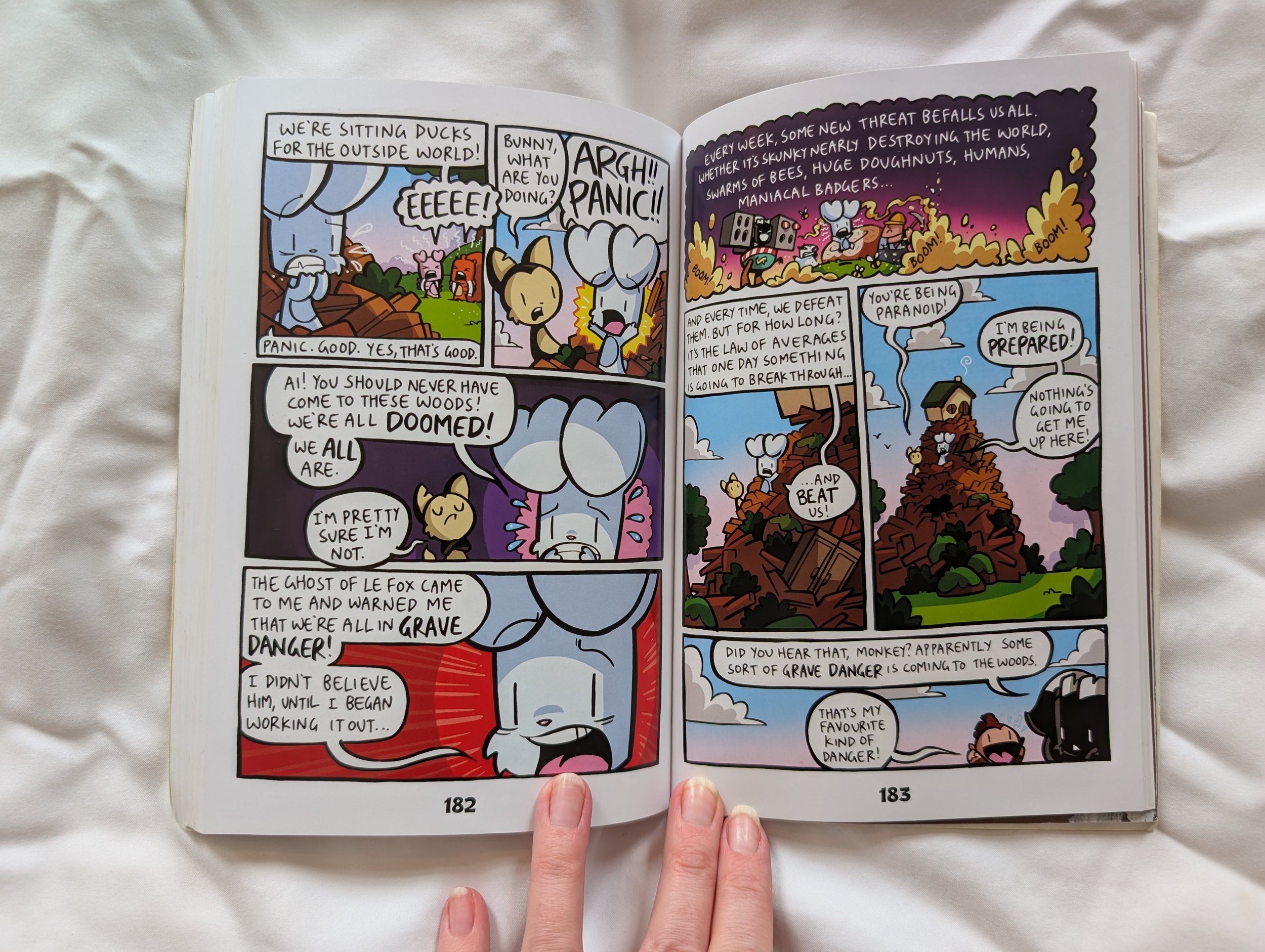
On a comic book style page, there is a lot going on in each of the image panels, as well as the speech bubbles. It is clear where the speech bubbles at a glance of the page as whole, but their position on the page, or within each panel, size and shape are all varied. There isn’t much really here that could be easily changed in this style and format to make these most accessible. Could there more be space around the text in speech bubbles? Yes, but then you take away space from the pictures and detail, which is a key part of comic books.
As much as a hurdle as this seemed for my son at one point in his development, the Bunny vs Monkey books have become his comfort series. I do not know how many times he has read each book - hundreds of times, probably. I don’t think I have left the house without a copy in my bag for the last two years. You might wonder how, and so do I. I did sit down with him and go through quick tips on what he should look out for, where to look, the order in which to look at the panels. There are clues and formats to these things, once you know them – if you are fully sighted I think you have a shortcut to these. His love for the humour and brilliance of these books meant he locked in, learnt the patterns, accepted the eye strain and deemed this was a good use of his energy. He get a lot of joy and comfort from these books now.
But do I think there is a way to make this art style more accessible for him? No, I don’t.
Accessibility Issues – Little Explorers: Goodnight Forest
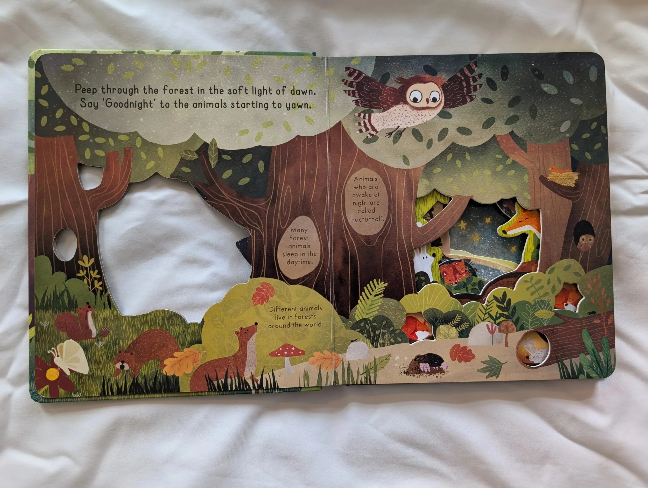
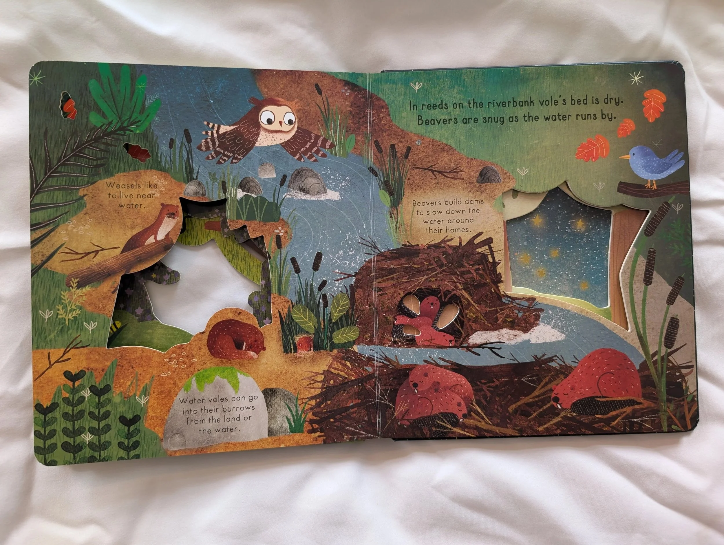
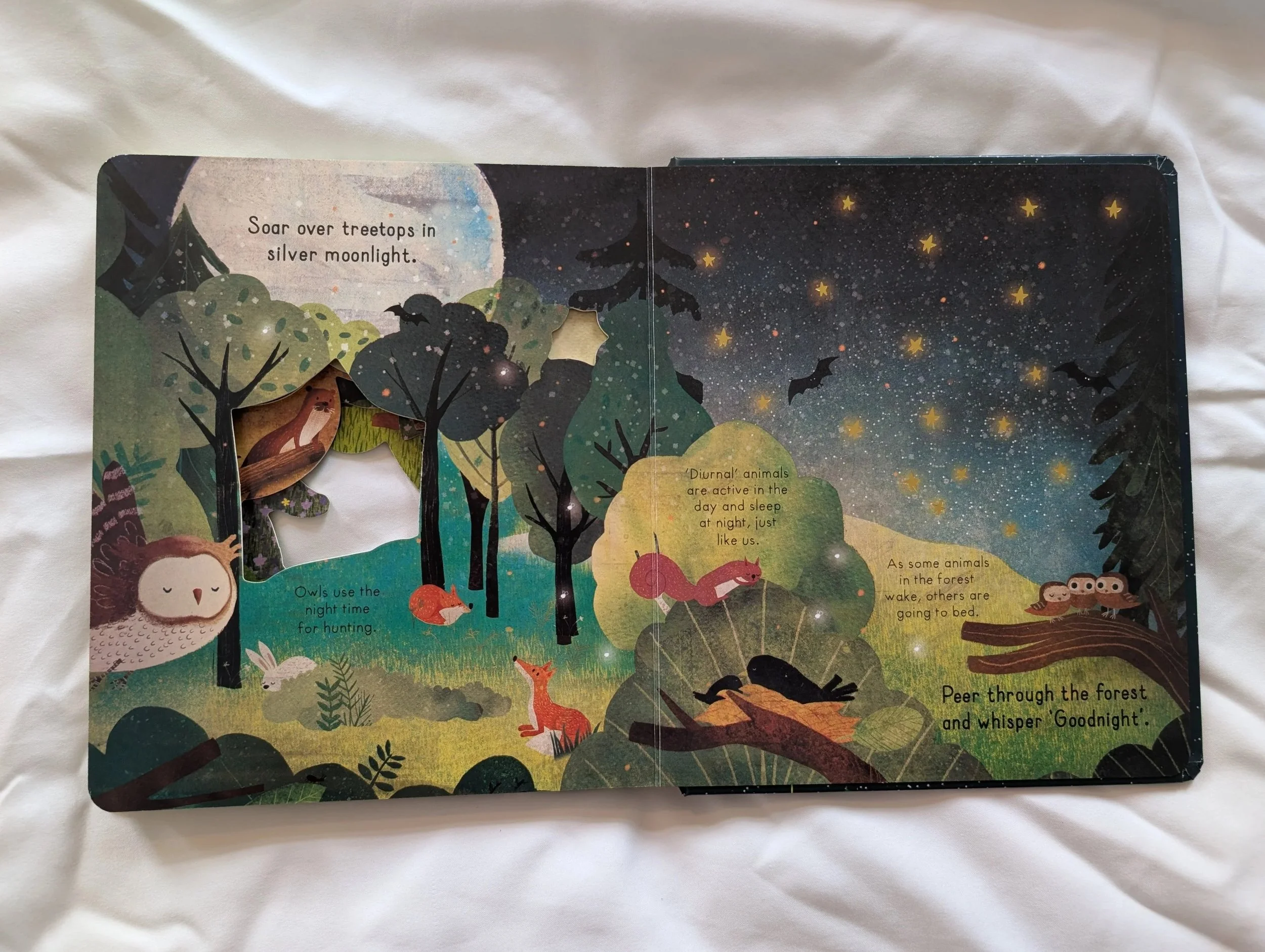
There is a lot going on visually on these pages. The text in various positions around the page, on different coloured backgrounds, in different shapes, all centred rather than left-aligned.
There is also a lot of adorable details in the illustrations, and this is intentional for the format – spotting all the animals snuggling and going to sleep on the page, as the child is doing as well, it’s a lovely bonding activity for an adult and child to do before bed. The diecut through the various pages adds more detail and depth, but adds to the overall visual overwhelm as well.
If the function behind a spread is illustration detail, then I think this should be balanced with clarity, ease of legibility and clear space around the text on the page.
All the text on this page is in a low contrast colour to the backgrounds (black on brown, black on green) and this adds to the overall visually cluttered feel on the page. The eye doesn’t not have a clear path of priority around this page, where are your eyes drawn to first? The diecut holes hiding characters, the text in the top left corner? Where is it drawn to next?
My suggestion for this design would be to have the text throughout the book, main text and flash text facts, on a single colour background for every page, so the eye tracks easily without effort to the text, that is on a high contrast to the background, so the eye can expend the energy enjoying the detail and playful nature of the illustrations and the diecuts.
Best Practice
Here are some of the best practice examples that come to my mind first when thinking about examples of page design that is fun and visually uncluttered.
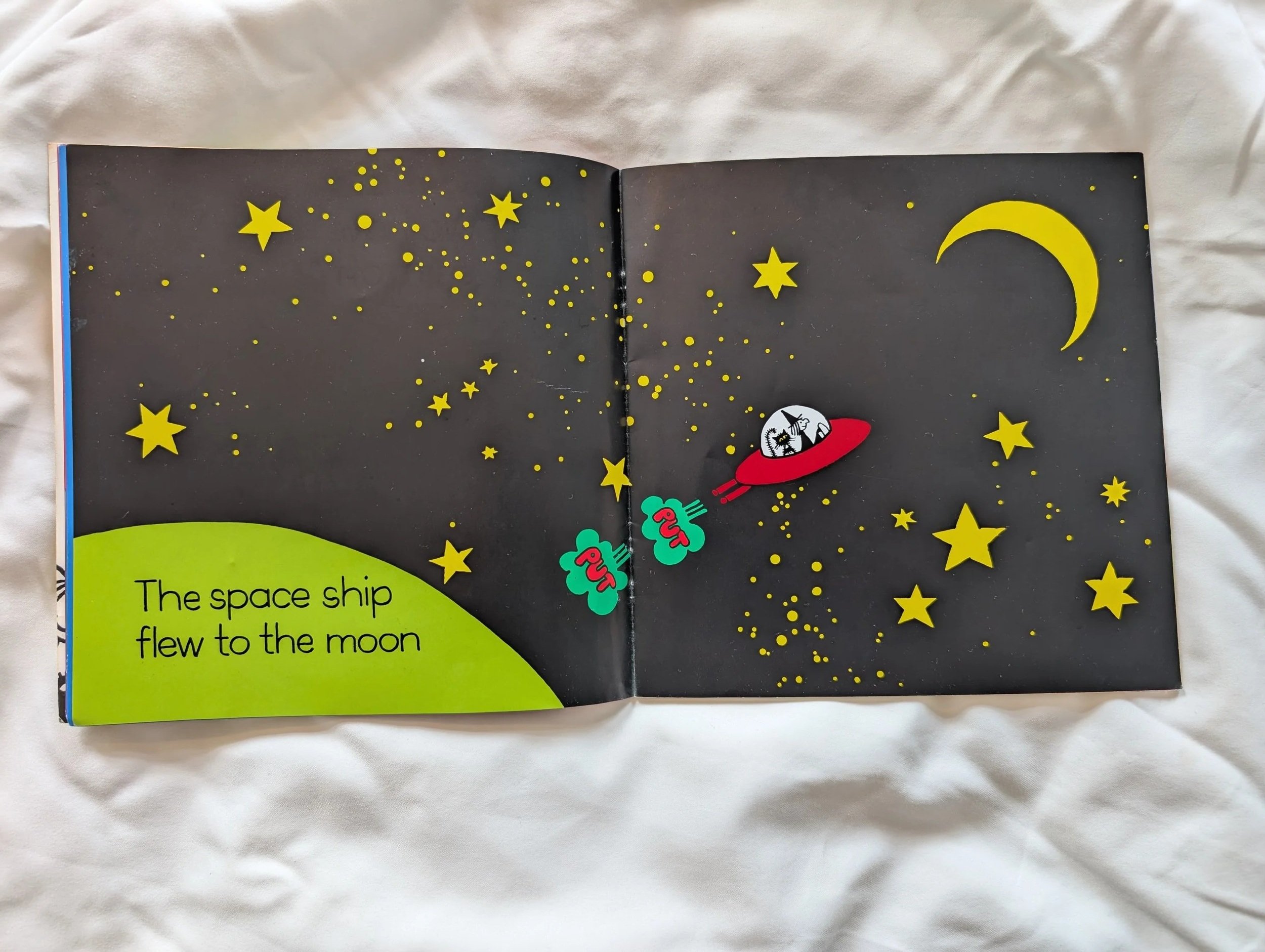
Best Practice – Meg and Mog (various) by Jan Pieńkowski, Puffin
When I was looking for books for my son that would be fun and easy for him to look at, as well as funny, I fell back on the Meg and Mog series again and again. He’ll still read these from time to time even now.
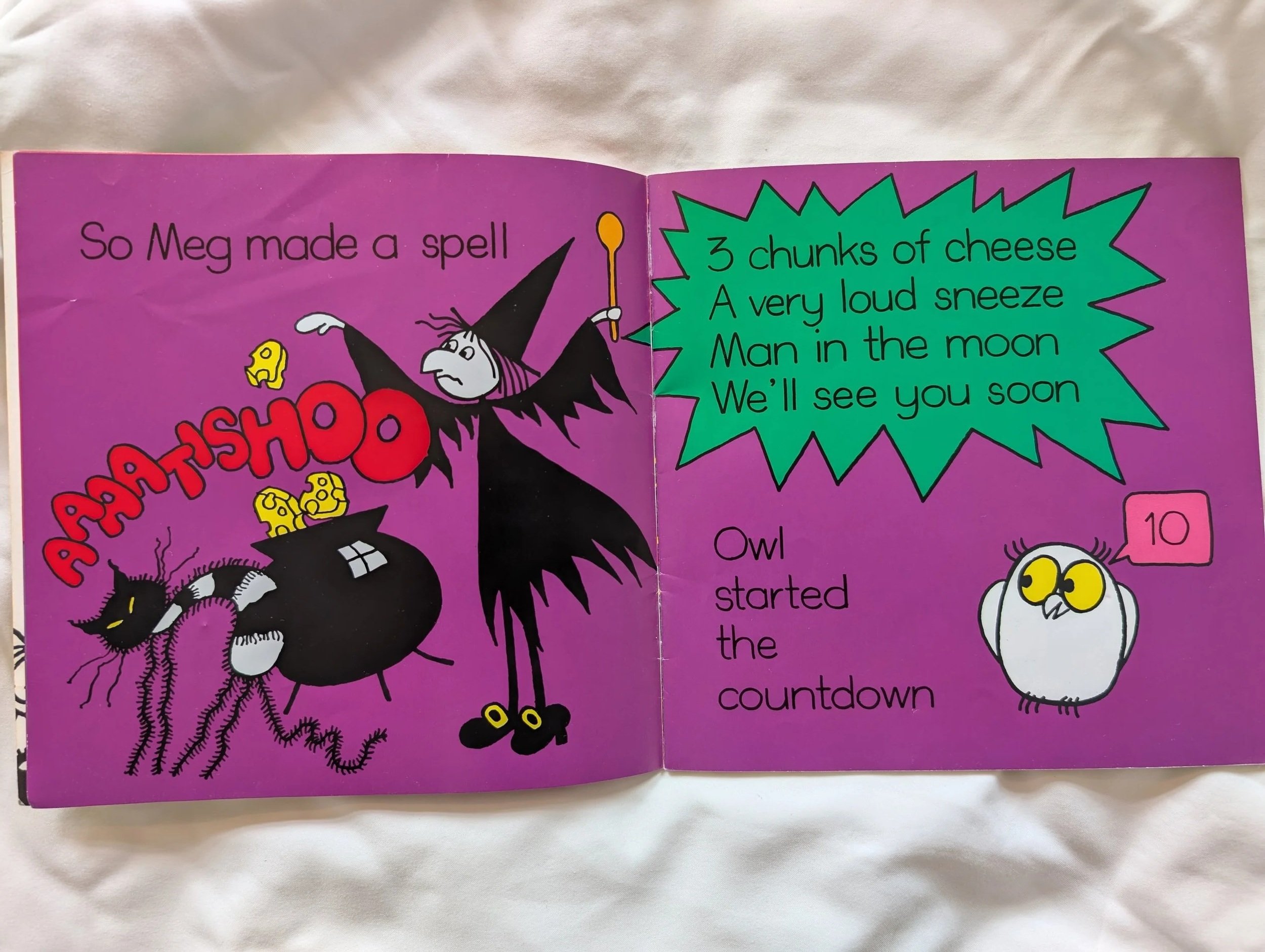
The text on these pages is large, clear, on a bold coloured background. The text and images both have space around them and the eye can track easily and freely around the page.
Best Practice – The World’s Most Marvellous Ridiculous Animals, Philip Bunting, Quarto
These pages uses space, and blank space, really well. The images are clear, large and bold, the text is (for the most part) on high contrast untextured background. For the majority of the pages, the bulk of the text is in the same position on each page, with labels around the image.
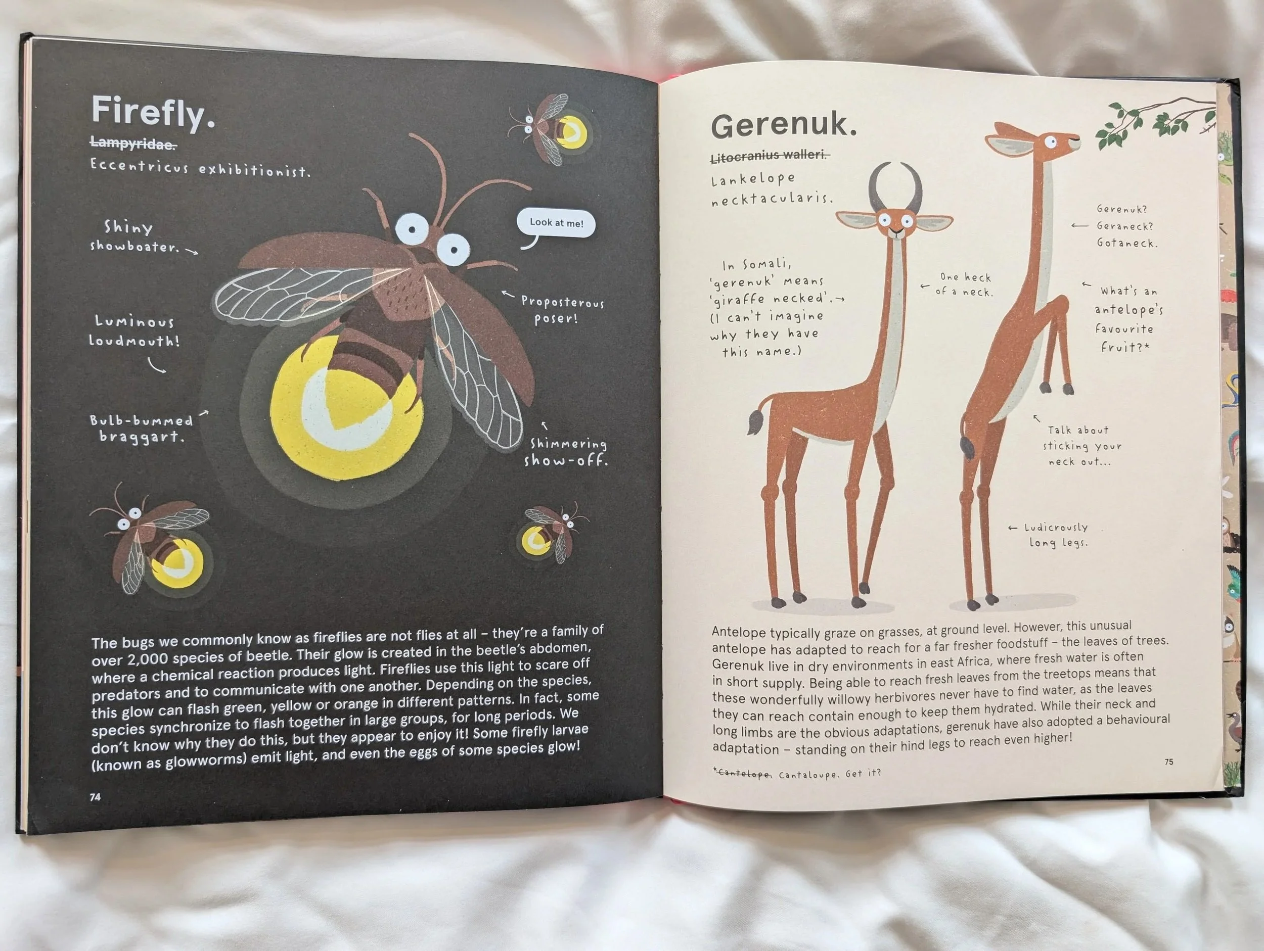
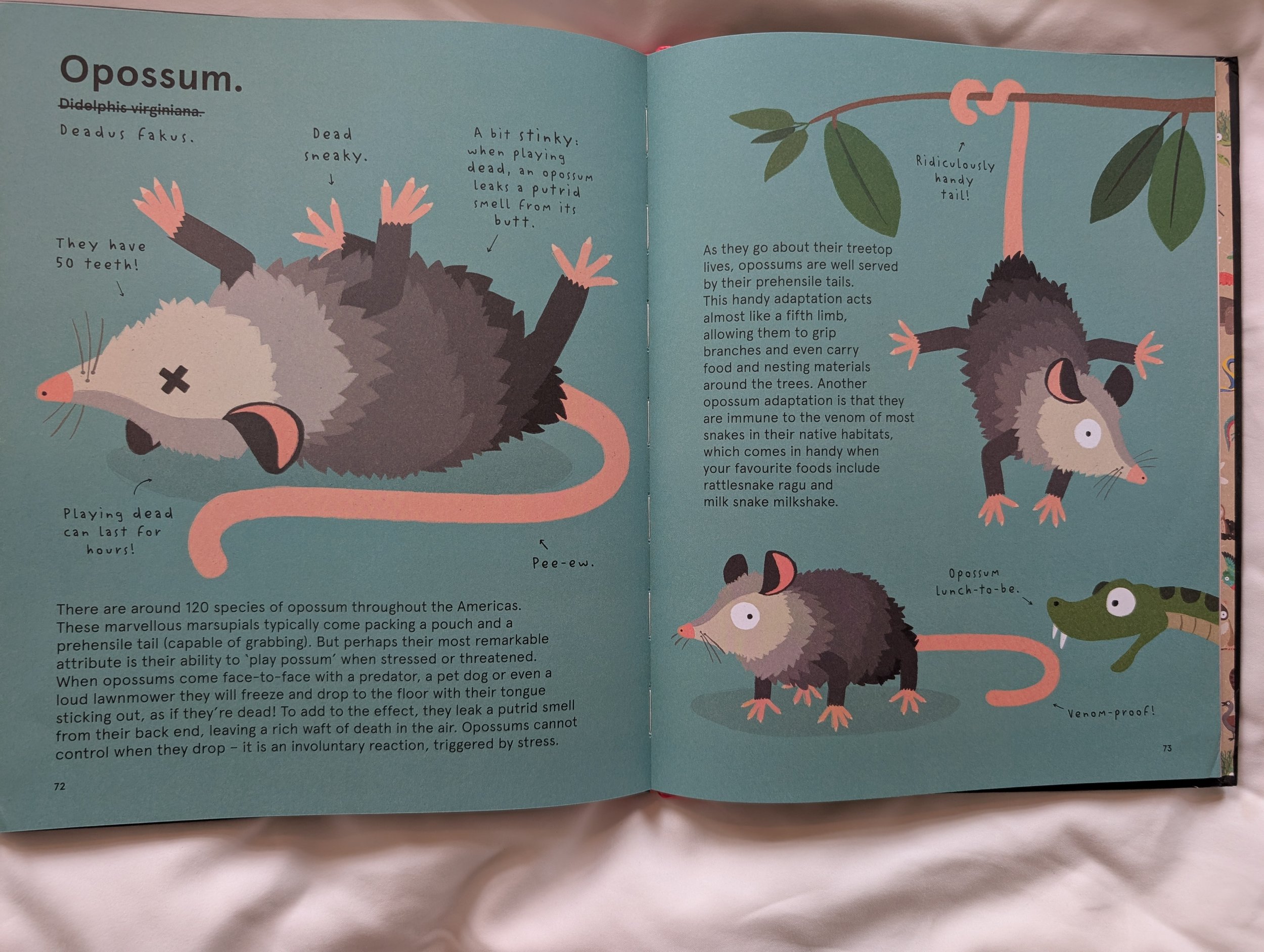
The page design throughout is a formula which gives a level of predictability for the reader as they turn the page. The style of text and adorable illustrations add to the humour and charm.
It’s easy to distinguish between the main body text and label text, due to font choice, though I do think the label font would be tricky for some to read due to its style. But I do encourage the idea of using fonts for visual difference between types of information in this way.
A suggestion I would make would be that for the Opossum page, blue background and black text is not very high contrast, even though the blue is fairly light.
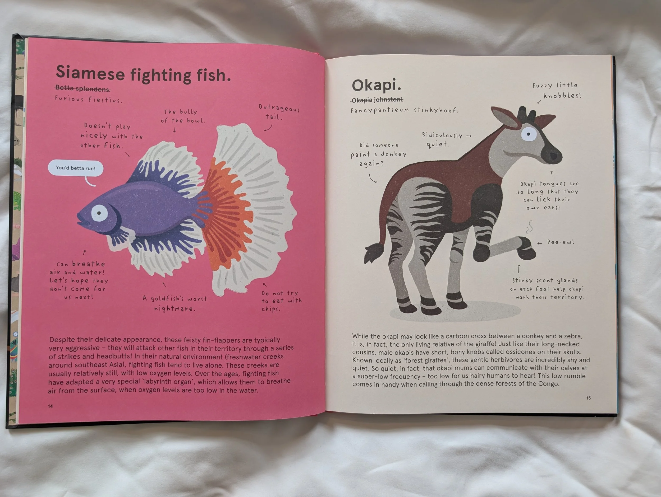
Good Practice – Weird and Wonderful Nature, DK
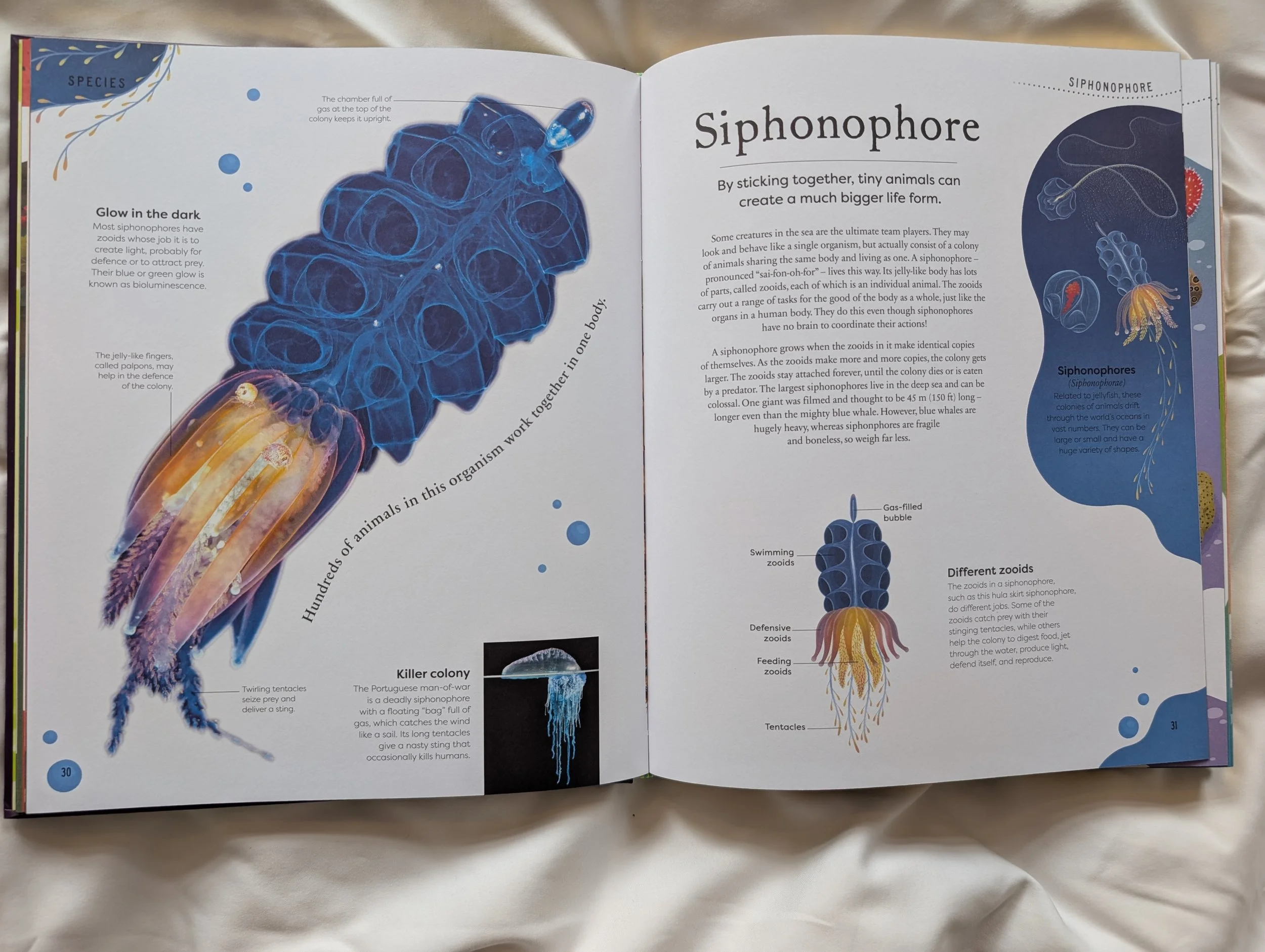
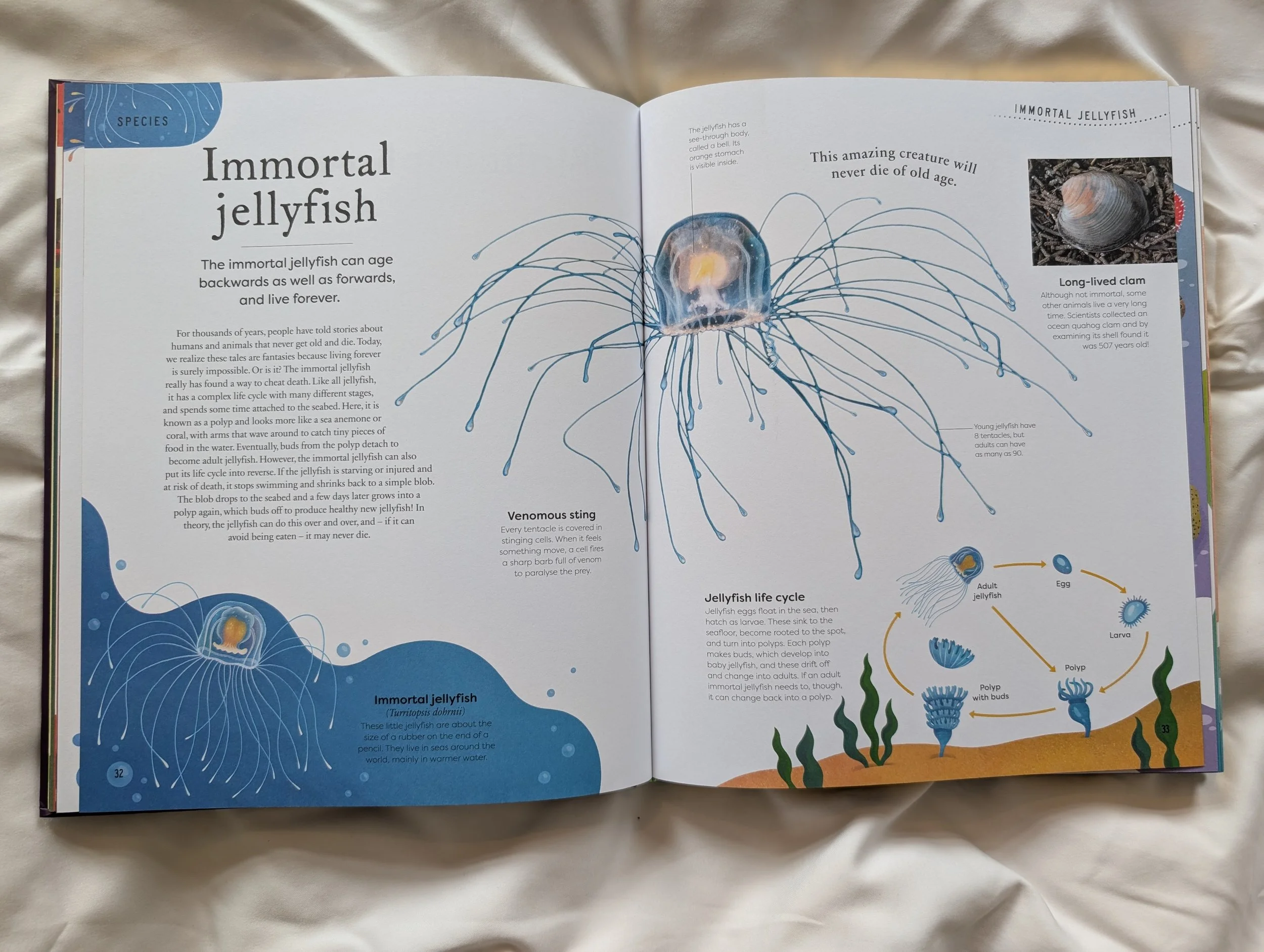
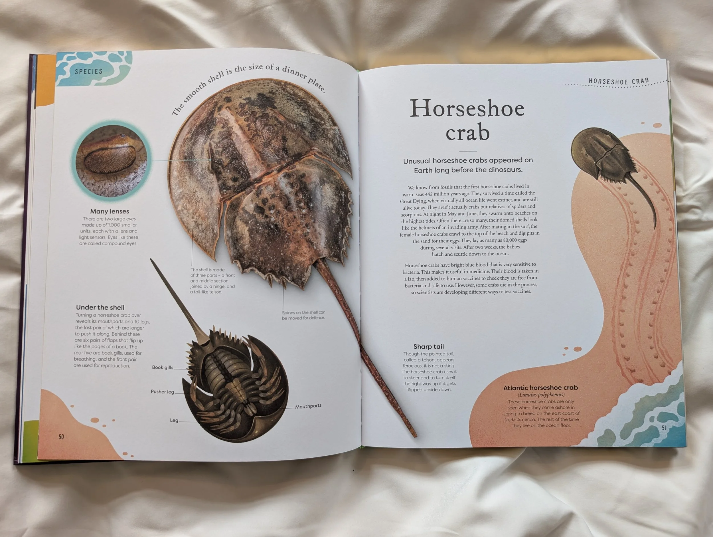
On the whole, these pages are clear, uncluttered visually. There is crucial breathing space left on the page between the text and the images, and there is still a lot of information on the page, plus the design is playful and informative to the page as a whole. Where this falls down in terms of accessibility are with text position predictability and text on arcs and shapes.