High and Low Contast Colours
I don’t think I could ever start a section on high and low contrasting colours in books without mentioning what looms largest in my mental rucksack of pet peeves: black text on dark blue backgrounds. Even worse, if the background is textured or has a shaded/ombre effect on it.
If I can achieve a singular thing in this life for accessibility in books, it will be the removal of black text on blue backgrounds.
High contrast colours is vital so those with visual impairment can see what’s on the page, depending on their diagnosis, some might not be able to see colour at all, they might be colour blind, they might only be able to see at high contrast and not be able to see shades of colour.
It isn’t only the visually impaired for whom colour choice and contrast can be a barrier to reading, there are also some neurological conditions, such as dyslexia, where colour combinations can become a barrier to access the text.
Of all aspects of accessibility in publishing, colour contrast importance is easiest to simulate, regardless of what your own eyesight or needs are. If you are a parent, you will likely have experienced this when reading at bedtime. All you need to do, is read a picture book in low light. Are there some pages that you find it is more difficult to see the text? That’s likely due to the text colour being at low contrast to the background colour it is on.
At low light, it is more difficult for the eye to distinguish between two similar colours – similar colours are at low contrast to each other. Whereas high contrast colours are still quite easy to distinguish even at low light.
Given that a majority of picture books are likely to be read during bedtime and some are ‘Bedtime Stories’, a time of low light, to have text on a low contrast background makes a lot of these books, especially the ones marketed for bedtime, unfit for purpose.
Since I have been talking about accessibility online, it is the issue of black text on blue backgrounds that comes up time and time again. The reasons for this are likely two-fold; it’s a common issue in a lot of picture books but also, it’s a issue everyone can experience for themselves.
I’ve been making social media posts recently to hopefully draw some attention around accessibility in children’s picture books, and a repeated comment I’ve received has been about illegibility of text in bedtime scenarios. One person commented to say she skipped those pages out of frustration, which given that the book she mentioned was a 26 or so page picture book, would mean a large percentage of the narrative was skipped! Which is not ideal, especially when the solution to these spreads is so easily avoidable.
The easiest way to show high and low contrast colours:

Quick Tips
1) Print it out! Contrast of print colours is easiest to judge when printed on the page. Backlit computer screens can add a clarity and contrast between colours which doesn’t translate to the printed page.
2) If you are unsure about a contrast level, take a look at it in low light yourself.
3) Avoid black text on blue/brown/dark grey backgrounds altogether. Completely. NO.
4) Don’t use colour alone to identify something or indicate meaning. If colour is used in a ‘Spot the Difference’ activity, for example, a change of a hat colour from red to pink is low contrast, but red to black is a high contrast change.
5) Note that while high contrast is great for those with low vision, some with dyslexia can find the glare that can be produced from a pure white background distracting and adds a barrier to reading.
Examples
My ‘Best Practice’ and ‘Accessibility Issues’ examples are actually from the same license and book series – Numberblocks Activity Annuals from Sweet Cherry Publishing. We have all 5 titles and they are well-loved by both my sons. In fact, my youngest son got it as a party bag present and the boys argued over it, so my friend gifted the whole range for my youngest son’s birthday!
From an accessibility point of view, this license, Numberblocks, is pretty solid. It’s visually clear, uncluttered, and the page layouts flow in an easy and clear way. Simple vector images, bold colours and the design has the text on plain coloured backgrounds.
The Numberblocks each have their specific colour schemes, and this, in part, works to make these designs easy to follow and read. But in the same way, the colour schemes are problematic on some pages in the design in terms of contrast.
Best Practice
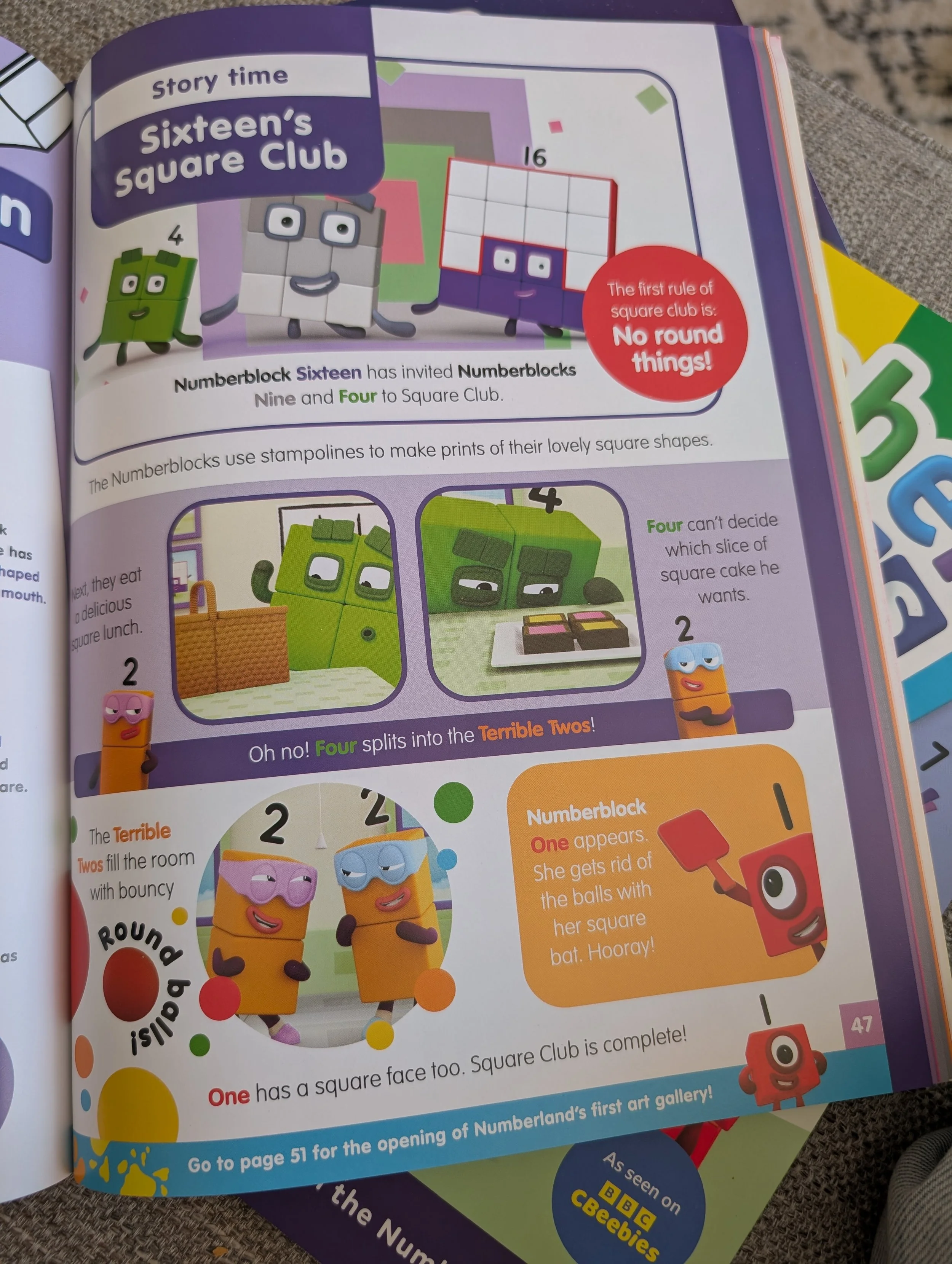
The colours of each of the numbers for their names is each clearly visible on the bold, single colour backgrounds. ‘One’ on orange background is moderately low contrast though.
Accessibility Issues
On quite a few page design templates for this series of Numberblocks books, the colour the character name is written in is a darker shade of the colour on the same colour background, which is very low contrast and will be difficult for those with visual impairments and other print disabilities to see.
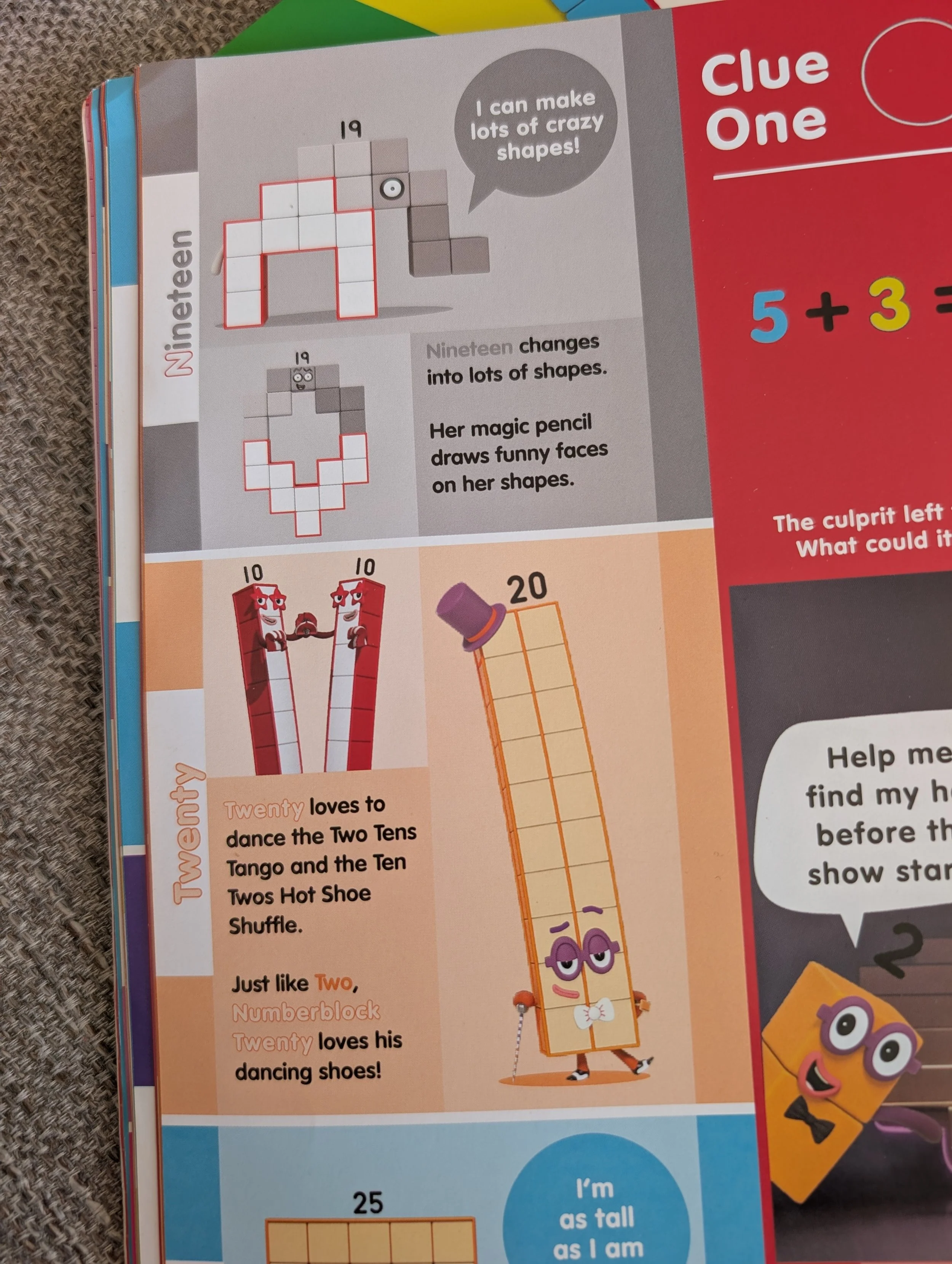
Let’s focus on the words ‘Nineteen’ and ‘Twenty’ on the grey and orange background.
‘Nineteen’ in a grey shade on a slightly lighter grey background is very low contrast and will be very difficult to see.
I can see that ‘Twenty’ has been given a darker shade keyline around the word to differenciate it from the background, but as this keyline is very thin, for those who struggle to see detail, this won’t be visible.
My suggestion here would be to make the background behind these blocks of text white, which is in line with the design of the license, and would be more legible.
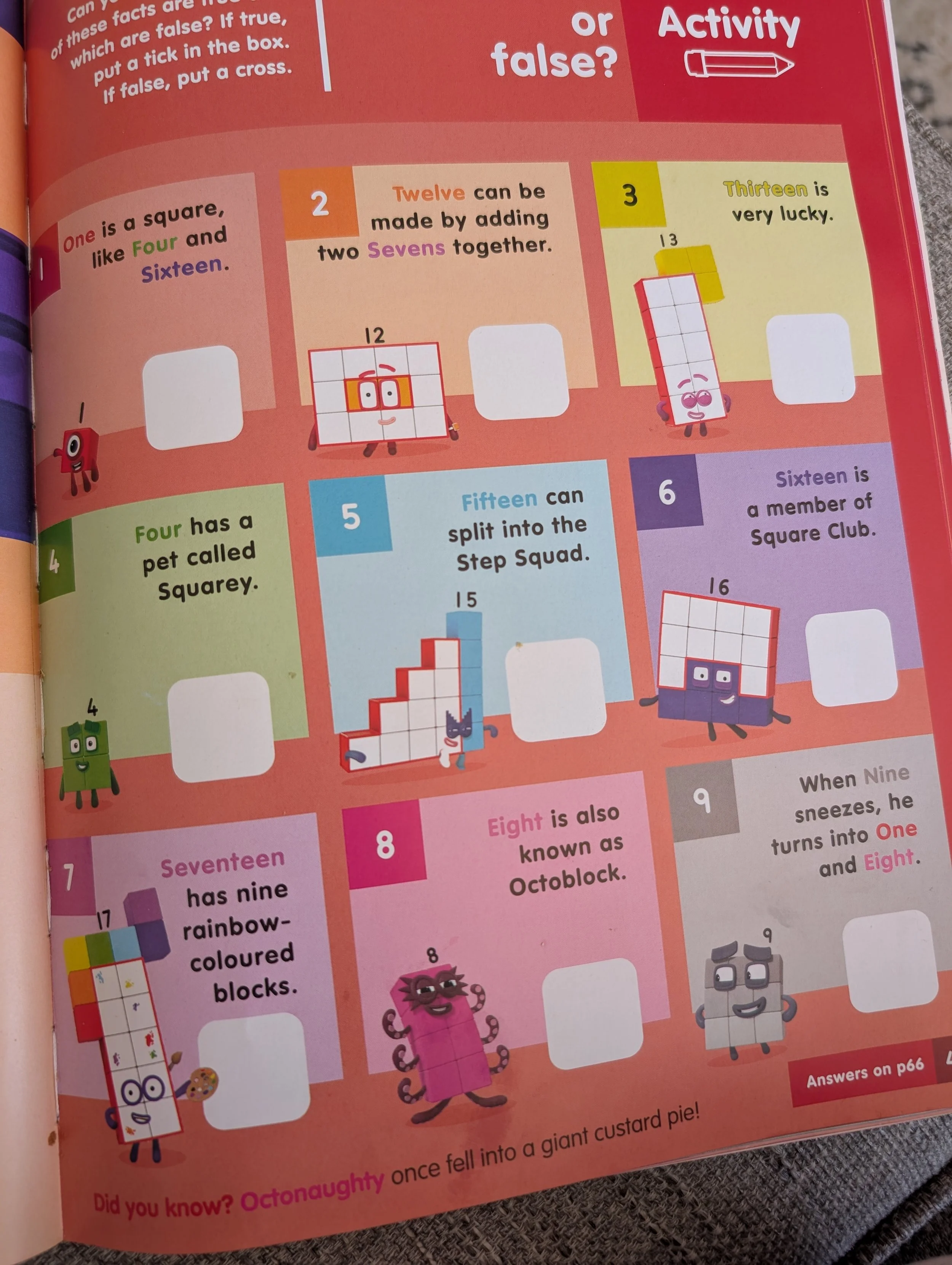
The same colour contrast issues can be seen on this page too, and the similar keyline issue on ‘Thirteen’.
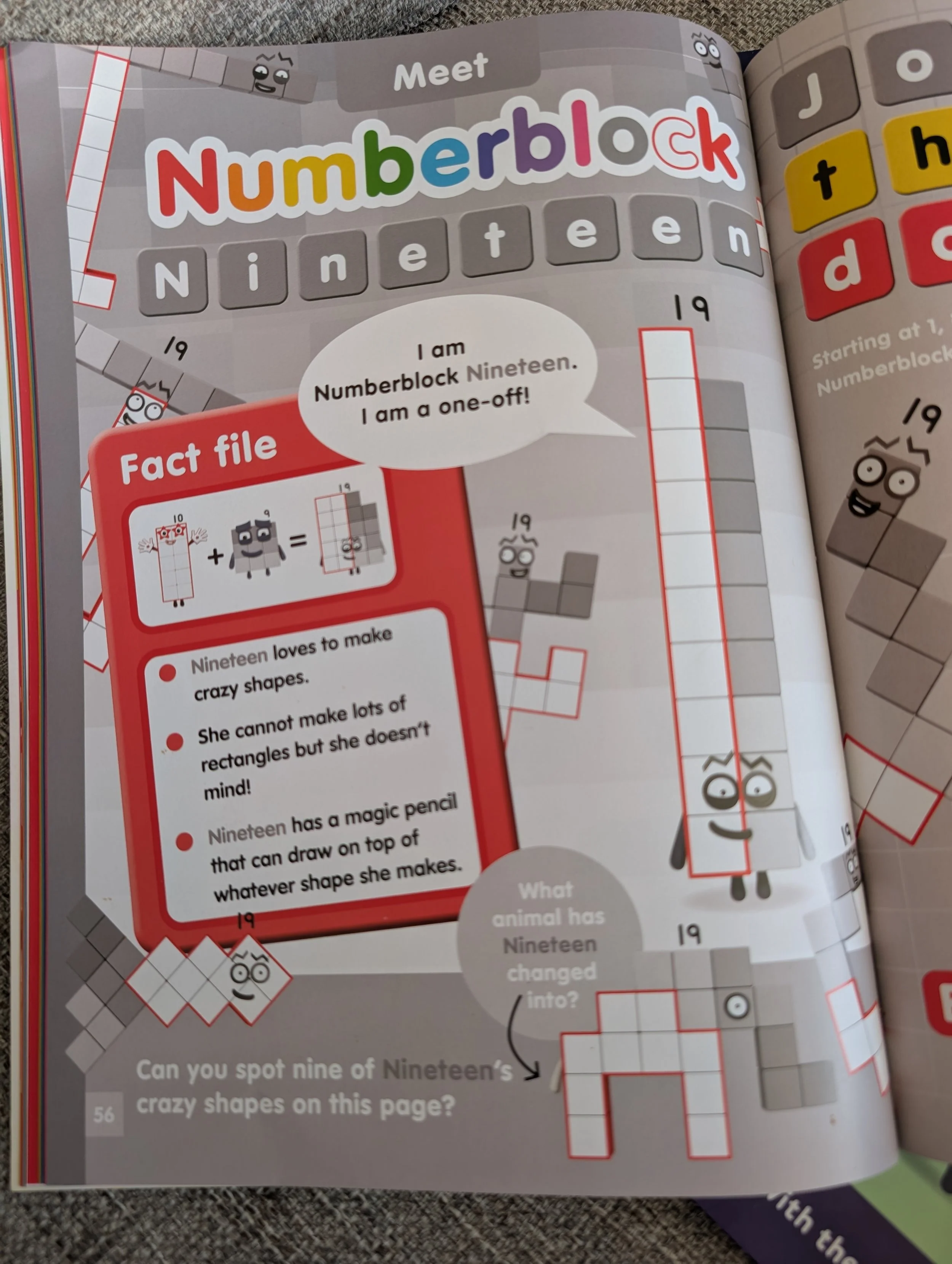
And the most extreme example is ‘Meet Numberblock Nineteen’ page where you can see most of the page is low contrast grey shades.
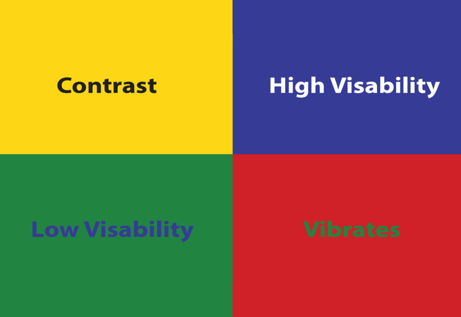
High Contrast Colour Combinations
Per recommendations from RNIB, these combinations provide maximum visibility for text:
Black on White or Yellow
White or Yellow on Black – Reduces page glare caused by light reflecting off a very white page.
Black on Cream or Off-White – Reduces glare for readers with dyslexia whilst also maintaining contrast.
Dark Blue on White – Provides a high contrast without the intense vibration of black and white combinations may cause for some.
Low Contrast Colour Combinations
Red and Green – This is also an issue for those Red-Green Colour Blindness, which is the most common.
Blue and Yellow or Purple
Light Green and Yellow
Green and Brown or Black
Light Grey on White
Blue and Grey