Book suggestions for Visually Impaired Children
On a TikTok I posted a month ago, a person in my comments mentioned that their visually impaired child was struggling to read, so I said I’d pull together some book suggestions that are easily accessible for those with visual impairment or low vision.
If you have any additional book suggestions, please get in touch and I will add to my list. I have arranged the book suggestions by age group, and the age grouping assumes a typical developmental path which might not match with what your child is doing, interested in or capable of at any given time. Children all develop at their own time and in their own way, what worked for my child might not work for yours. In fact, what worked for one of my children didn’t work at all for the other. I believe passionately in supporting your child in the moment and following their interests.
Newborn to six months
Features to Look out for:
Black and white books (or black and white with a single colour)
Large, clear images
No textures on the images – no shading/patterns
1 image per page
Touch and feel elements – noise elements work well
Examples:


How to use these books with your baby:
First thing to note is that every child’s eyesight is different and will develop in different ways, so please consult your child’s doctor and/or ophthalmologist. The below is how I used black and white books to toys with my visually impaired baby.
Tracking
Slowly moving the toy or book from left to right. This helps develop their eye tracking (following an object from side to side). If you can make a noise for them to follow
Holding a book in different positions in their visual field, and making a noise to direct their gaze
Focus
Prop up the book in front of them during tummy time
Position
Move the book or toy to be various distances from your babies face/eyes. Do they have a reaction to the book/toy at a certain distance?
Colours
Red is usually the first colour a baby sees reliably, at 2 to 3 months old, with blues and greens following shortly after. For my child, the colour he responded to first and most enthusiastically was yellow. I am not sure why that was, but yellow toys, objects and lights always drew his attention.
Make sure the pictures and colours used in the books are bold, clear and large so their eyes can more easily focus.
6 months to 18 months
For this stage of life, books are toys and function as something the child can interact and play with. I used books at this stage of life to spark interest, develop focus and hand-eye coordination.
Features to look out for:
Bold, single colour images
High colour contrast
Large images
Large text in a predictable position on the page
Textures (touch and feel)
Mirrors
Tabs and flaps
Examples:


18 months to 4 years
This is the time I introduced a variety of different book formats and styles, but this is also the time I came across the most issues for my son actually being able to see the books easily or comfortably.
These were the formats and publishers who most reliably made the most accessible formats (though not every page or every book unfortunately).
Early Readers
This is a pretty safe format in terms of being easily visible. The text is quite large, the fonts are clear, the text is on white backgrounds and on the page in a clear, predictable positions.
The readers aimed at the younger readers are best here because as the books are aimed at older readers, the text size gets smaller.
A tip: usually the older, more vintage books (particuarly picture books) are more easily legible, and have more text on white backgrounds. Partly because this was the style and, I think, because readability was more important then over making the books a piece of art.
Features to look out for:
Large text on a white background
Separate pictures
No text on top of pictures, textures or low contrast colours (blue, green etc.)
Examples:
**NB - these are sample pages that work best accessibility-wise. Not all pages in these book samples are accessible, but show a style to look out for.


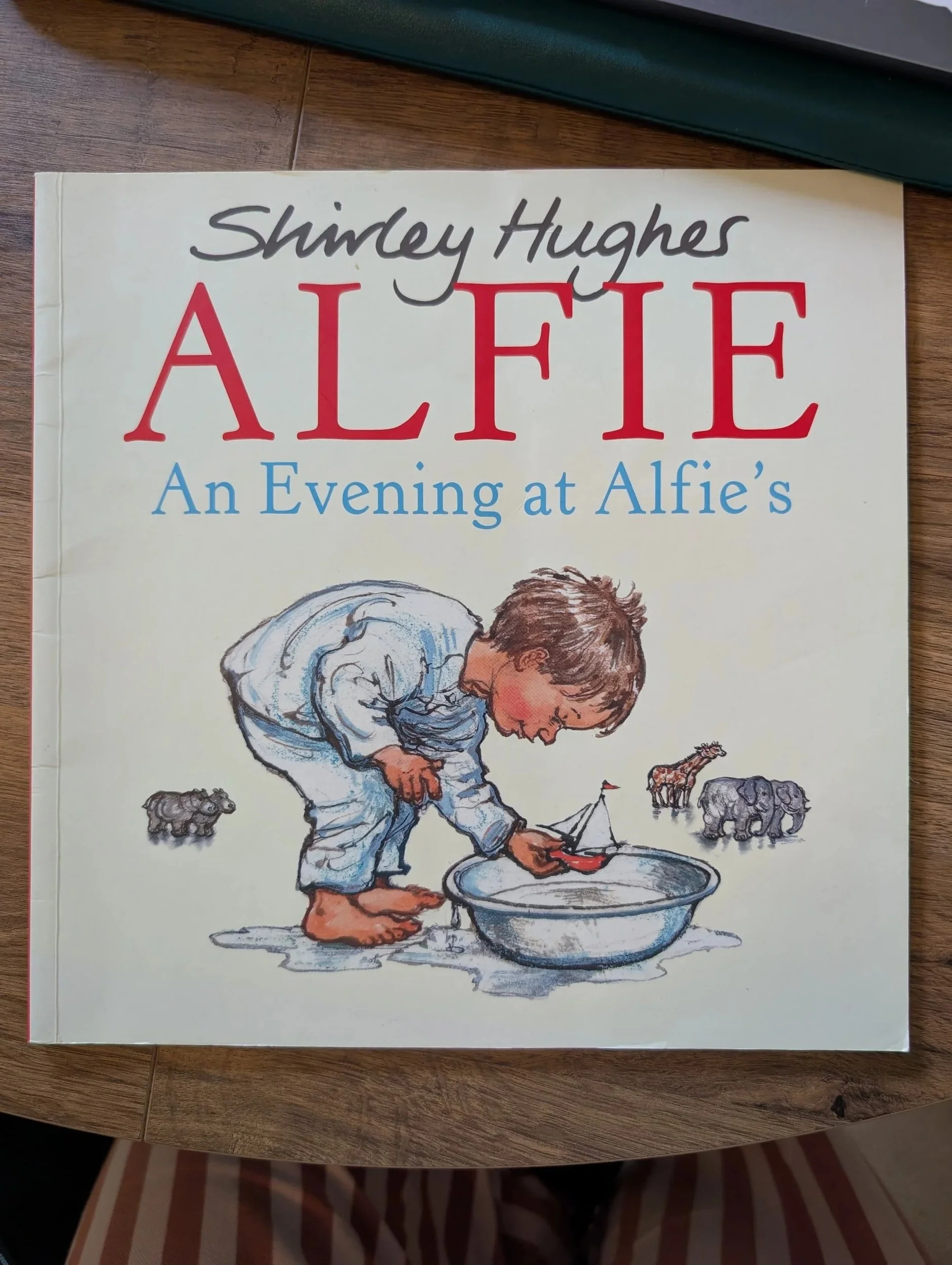
Picture Books
This is the format I found most difficult to source books for my son at this stage, due to poor colour contrast, text over images and textures as well as visual clutter. The styles to look out for are picture books that don’t have large double page images with text over the top, but rather text on a white or single high contrast colour background.
Younger picture books will have larger text size, and ones aimed for older children will have smaller text sizes.
Features to look out for:
Large text on a white (or high contrast colour) background
Separate pictures and text
No text on top of pictures, textures or low contrast colours (blue, green etc.)
No large double spread images with text on the top
Clear, sans-serif font
Examples:
**NB - these are sample pages that work best accessibility-wise. Not all pages in these book samples are accessible, but show a style to look out for.


Ebooks
I didn’t have any success with the digital ebook versions of picture books – not as I expected I might. It seems like a perfect solution doesn’t it, because you should be able to zoom into the text, to make it a comfortable size to read. Issues I encountered were as follows:
1) If the text isn’t that legible on the page to begin with, it doesn’t matter how much you zoom in, it’s still difficult to see.
2) A majority of the ebooks I found were PDFs, so when you did zoom in, you had to scroll around the page to find in the text, it was never a case of selecting the text and zooming in easily on that part. Then you had to scroll and navigate across the zoom in image to find the next text block.
3) Most ereader apps you can find, marketed towards the visually impaired are for adults, so they cater to novel format. Every ereader I found only supported single page view, so for picture books where a lot have gorgeous double-page images, it is either split into 2 separate pages.
**The last research I did into digital picture books was 4 years ago (around 2022), so it might be much better now, with the European Accessibility Act that’s come into force since.
A huge plus for ebooks is that when your child moves onto chapter books and junior novels, they can read on a digital reading device (Kindles and alike), and can make the text any size they like. There is a massive gap though to help and support a visually impaired child’s reading through the picture book stage.
5 to 7 Years
Young Readers
As your child works their way through readers and develop their reading skills, they’ll move onto more complicated stories. Reader-style books work well for this stage.
Please note: font size does get smaller as the books become more difficult.
Features to look out for:
Large text on a white (or high contrast colour) background
Separate pictures and text
No text on top of pictures, textures or low contrast colours (blue, green etc.)
No large double spread images with text on the top
Clear, sans-serif font
Examples:
**NB - these are sample pages that work best accessibility-wise. Not all pages in these book samples are accessible, but show a style to look out for.
Both are these from Usborne Books, and I do their books are reliably accessible, so I always feel safe picking these up.


Picture Books
As with the readers, the font size gets smaller when aimed at slightly older children.
I often found as there is more text in these, usually readability becomes a higher concern, rather than the art of the book which makes them slightly more accessible.
Features to look out for:
Large text on a white (or high contrast colour) background
Separate pictures and text
No text on top of pictures, textures or low contrast colours (blue, green etc.)
No large double spread images with text on the top
Clear, sans-serif font
Examples:


Hardback / Fact Books
My son is a fact kid, and he loves the large, gorgeous hardbacks that are full of facts. In particular, any of these sorts of books from DK are always clear, clean and easy to focus on and read. Text sizes vary hugely in these sort of formats.
Features to look out for:
Clear, sans-serif font
Separate pictures and text
No text on top of pictures, textures or low contrast colours (blue, green etc.)
Space in the design, especially between text and images, so each can be easily focused upon
Examples:


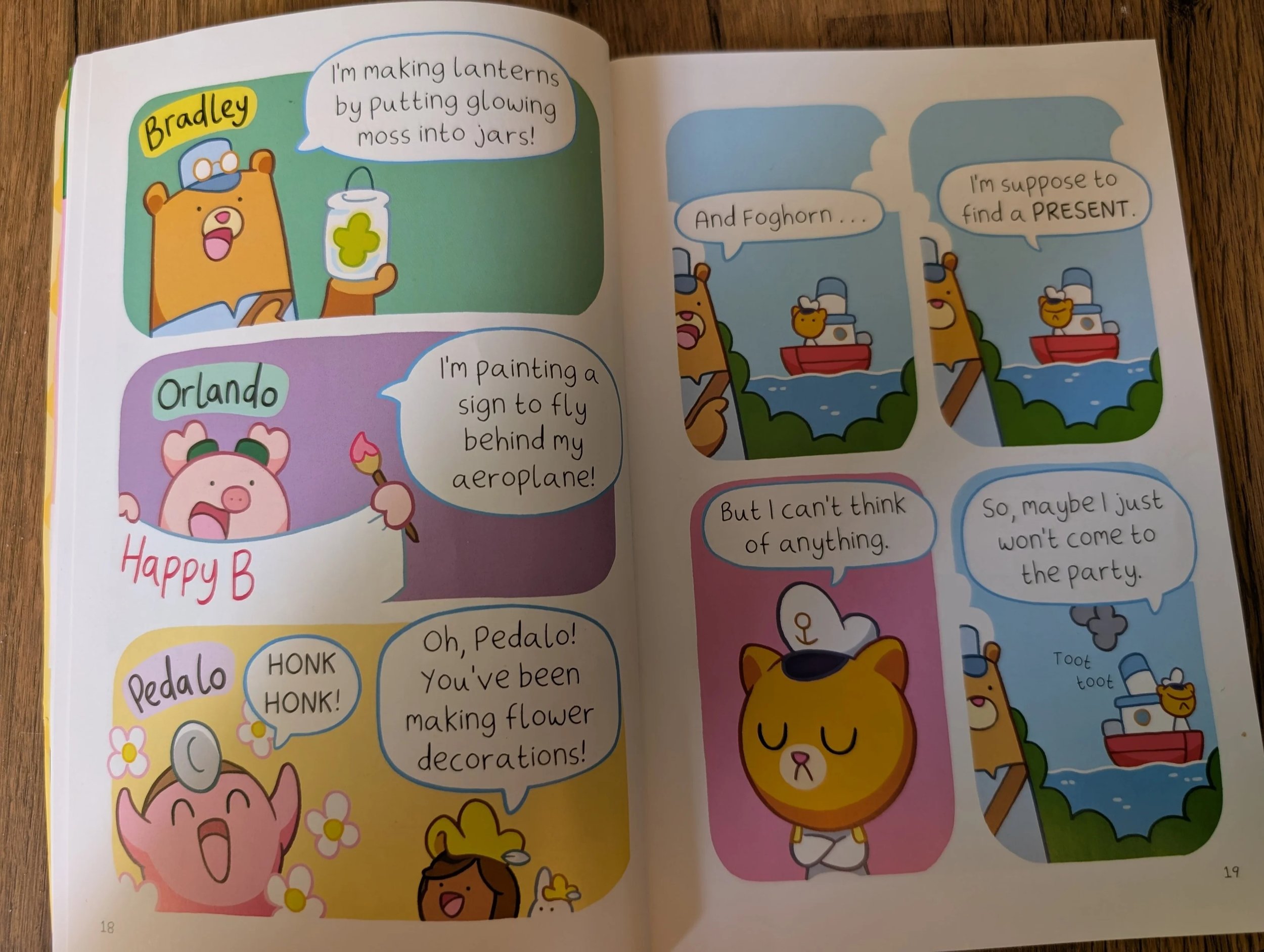
Comic Books
This likely is a controversial suggestion, and it did take some time and work for my son to get on board with reading comic books.
I always thought he’d love the humour and action of them, but as a style, comic books are very visually cluttered and unpredicatable in terms of image and text placement, so they are quite difficult to focus on or folllow.
I found some simpler, cleaner style of comic stories, and got him into the format that way. I sat with him for the first few, showed him which order to look at the comic book panels, which order to read the speech bubbles, where to look first on the page etc.
We then built up in the complexity of the comic styles, to include more detail. It did take some time, but then the Bunny v Monkey series became his favourite, comfort series. He reads those books over and over again, so I think the time and effort we put into this has been so worth it.
Examples: