Accessible books and dyslexia
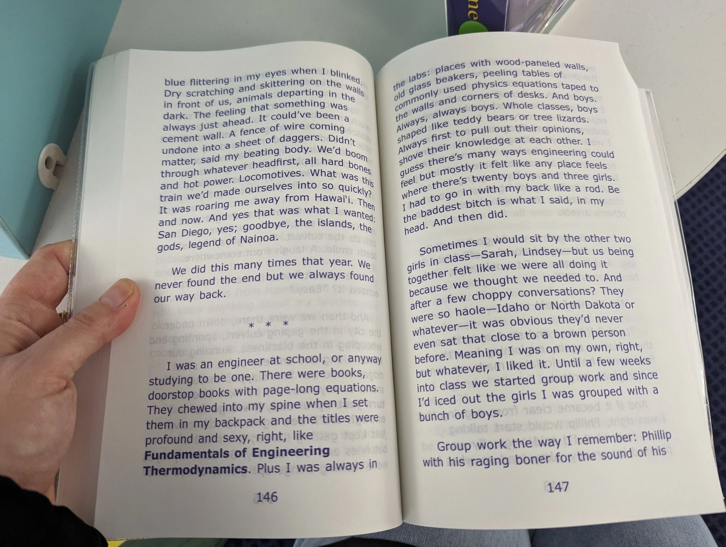
Last weekend, I went to my local library and was fizzing with excitement to see a display of Dyslexic Editions from Clarity Books as part of a promotion with British Dyslexia Association.

Spine of a Dyslexic edition of 'Sharks in the Time of the Saviour' by Kawai Strong Washburn, Clarity Books
Coming from the back of a week where I have discovered that the Phonics scheme my child follows at school does not offer large print versions, it was a lovely light to draw me through the tunnel of frustration and despair I found myself in. During those moments where I am in the deepest, darkest part of the tunnel like this, I worry that I have found a problem that I believe to be an important one but fear that in reality it’s just an important problem to me. Is there a market for accessible books at all because if it was so crucial to meet the different reading needs, why aren’t (more) publishers, especially those providing books and educational resources for the classroom, doing so?
With the light of Clarity Books and the Dyslexic Editions placed so prominently to raise awareness in the library that such editions do in fact, exist, I decided to do some research into Dyslexie Font and how it all worked worked to help readers with dyslexia. Christian Boer, who developed this font did a fascinating TED Talk on this.
I have also started reading ‘Reading in the Brain: The Science of How We Read’, and in the chapter ‘The Eye: A Poor Scanner’, Dr Dehaene details how the eye and brain work together to make the act of reading possible, that our eye scans over the characters on the page in a movement called a saccade, a jerky movement back and forth, and that is what brings the information to the fovea, “which occupies about 15 degrees of the visual field, and is the only part of the retina that is genuinely useful for reading.” (page 13, Reading in the Brain, Dr Dehaene). A single gaze only reads seven to nine characters at a time, and the rest of the page appears in a background and unfocused blur.
After learning and experiencing how someone with visual impairment and low vision experiences text and reading, learning this has helped to give scientific evidence to my growing theory about how crucial focus is for reading on the page of the picture book, for young readers who are just learning to read as well as those with different needs.
Dyslexie font and Christian Boer
Christian Boer’s TED Talk on YouTube opens with the below image, which is a visual example of how a person with dyslexia may view the text on a page. (From my very basic research into dyslexia, I have learned that here are different types of dyslexia, so it might not always present in this way.)

A visual representation of dyslexia from Christian Boer’s TEDx Talk.
The font Boer created, Dyslexie, works to add differences between similar groups of letters, so that a reader with dyslexia doesn’t mix them up as frequently. As a non-dyslexic reader, seeing the letters grouped as he did in the TED Talk was the first time I’d truly appreciated how similarly-shaped letters are, despite working in publishing and being interested in typography and reading. It had still never occurred to me to dwell upon how and why these letters might be mixed up because my eyes and my brain have no problem differentiating between them. As my regular refrain in my accessible book posts comes back again, until you learn these things, open up your perceptions, feelings and eyes to how others experience things, how could you know?
For other typography nerds, how Dyslexie works is absolutely fascinating, each feature carefully thought through to avoid common issues dyslexic readers have: bottom-weighting the font to give an easier orientation of the character, making ascenders and descenders longer for added character differentiation and increasing leading spacing to list a few examples, it’s beautifully explained here.
What struck me most, is the top comment on Boer’s TED Talk YouTube:

Boer himself cites the statistic that it is estimated that 15-20% of people in the USA have dyslexia (00:34, How a font can help people with dyslexia, TEDx Talks, YouTube) which is quite a significant proportion of a population. So why shouldn’t we reconsider our approach to teaching reading in this way, giving as high a percentage of children as possible the best start when learning to read, making sure all children start learning to read in a space that is designed to make sure most of them thrive and gain as much confidence in themselves and their abilities. From that foundation, confidence and enjoyment gained in the early years will surely only be a blessing for them as they get older and start to find things more difficult.
Especially as mirroring characters, flipping them and struggling to differentiate between letters are all normal stages of learning to read, if there is a font which can help this for those with dyslexia, surely it would help early readers too.
Again, as I delve ever deeper into the world of accessibility in books, I am not suggesting that an amalgamation of aesthetic is the way to make books more accessible, but I think there are small changes that can be easily made and considered in publishing which will be a huge help.
Especially for educational publishers and the books they produce, there really needs to be editions available for various needs, like dyslexia and low vision, I don’t really understand why these things haven’t been considered in the forefront; to my dismay I keep finding that if these things are considered at all, it’s secondary, additional or not at all.
I do think this is where technology and digital reading, (ebooks and apps and perhaps AI will become key in helping the easy production of these accessible editions. There is already accessibility software built into web design, app development and even Microsoft Word, where a programme runs through and points out where things might be inaccessible or not; I really think this process needs to be, and can be, incorporated into the book design and publishing. Apps, social media platforms, websites and more all have accessibility features built in (see Web Content Accessibility Guidelines), and it seems as though traditional book publishing is lightyears behind. And for a sector which produces something so vital, important and integral to how children learn to read, it distressing to say the least.
Colour contrast
On the Clarity Books editions I have seen, and since then after research, seen on other dyslexia-aware websites, such as British Dyslexia Association, there seems to be a use of dark-blue text on white or cream background.
Example spread from 'Sharks in the Time of the Saviour' by Kawai Strong Washburn,
Clarity Books showing the dark blue text.
The British Dyslexia Association (BDA) has a brilliant Dyslexia Style Guide available on their website, and it has a big section on the importance of colour contrast of the text and background, which is also an important part of making text legible for those with low vision too, not to mention legibility of text and a clear contrast with the background is so key for those beginning to read too.
There seems to be a lot of debate about colour overlays and whether that helped readers with dyslexia and there even seems to be medical argument over whether the idea of ‘visual stress’ is even something that happens. But focus and clarity in picture book can only be a good thing for all.
I do a Christmas book advent with my children in December, where I wrap 24 Christmas books up and we unwrap one each night to read. I bought two new books this year. One I was excited to buy was the picture book edition of The Christmasaurus, by Tom Fletcher because I love how his books are silly and fun – they always go down well with our two! I flicked through when it arrived and I quickly spotted a number of pages where the text colour and background contrast is a problem. There are 5 pages where it is nearly impossible to see the text at all. This book has 34 pages of story, including two double-page fold-out pages, and 10 and a half of the pages have low contrast between the text and background, which makes 30% of this book inaccessible and difficult to read.

The rest of the pages have vignettes and white, uncluttered space behind the text, so aesthetically if those problematic pages were amended it wouldn’t look odd or strange; it’d be in-keeping with the rest of the book.
I will list the low contrast pages here for full transparency (my edition is ISBN 978-0-241-46656-8): page 3, 13, 20, 22 (bottom half), 23, 28, 29, 30, 31, 32, 34. Not counted in my percentage above, but the bottom half of page 8, page 18 are marginal in contrast terms, and page 33 could be an issue too as BDA list pink backgrounds being difficult for some dyslexic readers.
Glossy Paper
I have found that glossy paper can be problem not only when reading with my visually impaired little one, but actually, gloss paper is pretty much always a problem when reading picture book in anything put flat, evenly disbursed light due to the glare. Avoiding glossy paper is something the BDA mention in their Style Guide too. At bedtime, when we read every day in a snuggly low light, the glare is often something we have to move the book around to avoid.
The thing with page glare is obviously something I am particularly sensitive to in my world where I can hyper-conscious of visual impairment, and that isn’t limited to glossy paper. But actually, it is an issue that is known and has been addressed - think about the Kindle Paperwhite one of it’s defining features is that is avoids glare in light, aside from it looking like you’re reading on paper, it’s one of the top selling features. So it is known that this is a barrier to reading, and it is accommodated for adult consumption. But for children’s picture books, they are so often printed on glossy paper which seems contradictory when children are the ones for whom reading is least accessible as it’s a new and difficult skill they are learning.
I know that glossy paper is preferred for printing due to colour vibrancy and honestly, when I am geeking out over paper quality, the fact that paper is glossy is one of my favourite things. It’s so smooth, shiny and it feels wonderful. But geeking out over paper quality is something that I am sure only a few people do, and probably lost on the majority. Is it worth the glare: absolutely not.
I have learnt so much this week and will take all these learnings with me as I continue to research and learn about accessibility. In the medium term, I notice there are quite a few aspects of my own website that I need to adapt and change to make it more accessible to all needs, so I am adding to my list.